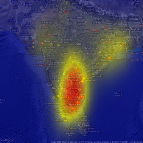
I gave it another go, trying to get a map that looks a bit nicer. This time, I tried to compute something like a density or intensity in a certain area. On the previous map, this was not visible very well. I used ggplot2 and a bit of R code, together with RGoogleMaps to produce the following picture:

The fact that many MFIs are clustered around in the south is highlighted quite strongly. What this graph does not take into account however, is their variable size. This is problematic and I agree that this needs further refinement, i.e. that the intensity takes into account how big an MFI is. However, I would conjecture that this merely makes the contrasts in such a map just stronger.