Category Archives: Microfinance

Exploring Heterogenous Treatment Effects: Returns to Capital

Jon de Quidt and I recently looked a bit into the data from the paper of De Mel, Woodruff and McKenzie (2008) in Sri Lanka. It is quite an influential paper, experimentally administering capital shocks to microenterprises in Sri Lanka in order to estimate the returns to capital.

Their paper highlighted that the returns to capital “at the bottom of the Pyramid” could be very large indeed. In their favorite specification they find that these could be as high as 50 – 63 % per year (in real terms). This suggests that these investments pay-off on average. It was one of the first papers that used experimentally generated variation in capital stocks to estimate these returns. Thats why it became so influential and the authors have a set of papers on Mexico and Ghana, performing similar estimates.

They point out that there is a lot of heterogeneity in the estimated treatment effects. In particular, they observe that for female entrepreneurs, there is virtually no (average) treatment effect. This and the reasons that could be underlying this observation are explored in a second paper.

We had a look at the De Mel et al (2008) data, which is available here. We essentially ran their regressions of (reported) real profits on the treatment dummy. However, we did this iteratively for each individual treated person, using the whole group of non-treated individuals as counterfactual. This allow us to get an estimate of the treatment effect for each individual treated.

From this, we get a distribution of treatment effect estimates. The average of this should be the treatment effect that De Mel et al (2008) report in their paper. And indeed it comes quite close. However, what we are intrigued by is the significant heterogeneity in the point estimates for the treatment effect for different individuals.

A key observation is that the treatment effects are very heterogeneous – the mass of enterprises who saw a drop in profits is almost as large as the mass of enterprises that saw a rise, however, some saw a very significant and large rise in real profits. The vertical line is the average of the treatment effect, which here, as we lumped the cash treatments together, is around 900 rupees.  The median treatment effect however, is only  332 rupees. Thats some food for thought.
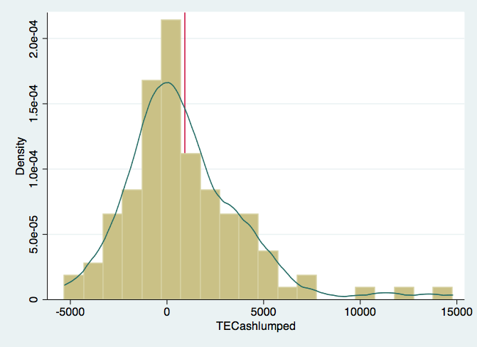
Histogram and Kernel Density Estimate of Treatment Effects for Cash Treatments

Microfinance Map of India – another go…

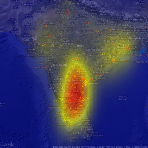
I gave it another go, trying to get a map that looks a bit nicer. This time, I tried to compute something like a density or intensity in a certain area. On the previous map, this was not visible very well. I used ggplot2 and a bit of R code, together with RGoogleMaps to produce the following picture:

This map displays the intensity of microfinance institution headquarter distribution across India. The data comes from the MIX Market.


The fact that many MFIs are clustered around in the south is highlighted quite strongly. What this graph does not take into account however, is their variable size. This is problematic and I agree that this needs further refinement, i.e. that the intensity takes into account how big an MFI is. However, I would conjecture that this merely makes the contrasts in such a map just stronger.


Microfinance in India: Getting a sense of the geographic distribution

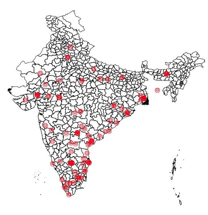
I am working on a review paper on microfinance in India and use data from the MIX market. Today, I was amazed by how quick I conjured a map of India with the headquarters of the microfinance institutions that report data to the MIX market depicted on that map. Ideally, I would have more geolocation data – but this is hard to come by. But what we can clearly see is the clustering of institutions in big cities and in the south, which was hit hardest by the recent crisis.

Microfinance Institutions across India


I dont think anybody has produced such a map before. In fact, I can do this for all institutions reporting data around the world, which may be interesting to see. Also, I already tried to make the size of the dot proportional to e.g. measures of real yield or color-coding the nearest neighborhood (say the neigbhouring districts) by the average loan sizes reported. Lots of things to do. Maybe thats something for the guys at MIX Market or for David Roodman who, I think has finished his open book.

The key difficulty was actually not in plotting the map (though it took some time), but in obtaining geo-data on where the headquarters of the microfinance institutions are located. I managed to obtain this data – though its not perfect – by making calls to the Google MAP API via a PHP script., basically using the following two functions:

Continue reading Microfinance in India: Getting a sense of the geographic distribution

Animation from Kiva data

I just came accross this amazing animation, which depicts lending flows from Kiva lenders to Kiva borrowers in the field. I have been working on a few pieces of research with my colleague Jon de Quidt using Kiva data. However, that work has stalled a bit as prioritization moved it towards the end of the queue. However, this animization is indeed inspiring and it is somewhat awaking the urge in me, not to wait too long to continue work on Kiva.


Intercontinental Ballistic Microfinance from Kiva Microfunds on Vimeo.

On another note, I am going to try to do some more work with R on mapping data, trying out several packages:

I found working with ArcGIS way too clumsy…


Joint Liability Group Lending still very much present in Microfinance

I have been looking at data from the MIX market recently. They provide a lot of financial data from microfinance institutions around the world. This data is made accessible to donors, but especially to other financiers of microfinance. It has helped us in the understanding of the state of the microfinance world, as it has become a central gathering point for data.

In recent years, more and more institutions started to disclose data on lending methodology. There are three categories. First “Solidarity lending”. It is not 100% clear, but from the glossary of terms on the MIX market website, I assume it means classical joint liability lending groups (JL). The other categories are “Individual lending” (IL) and “Village Banking”. A lot of early theoretical work has focused on the role that joint liability group lending had in context of classical problems  of adverse selection, moral hazard and ex-post moral hazard (enforcement problems).

Though in 2002 Grameen officially abandoned explicit joint liability and other institutions, such as BancoSol seemed to follow. So one interesting question is, whether institutions are shifting away from Joint Liability groups towards more Individual lending, or whether our perceptions are biased because two popular institutions have abolished explicit joint liability.

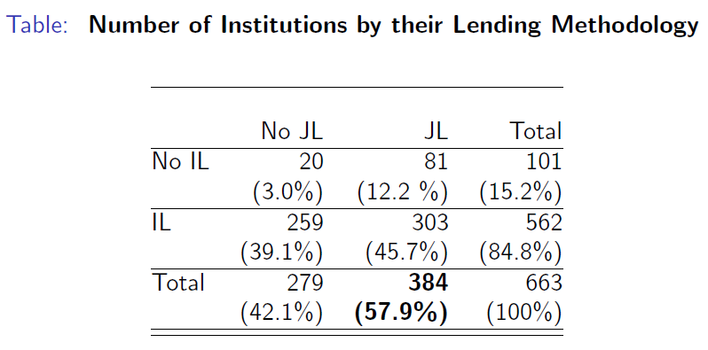
It turns out that in the MIX data for the year 2009, we observe that joint liability lending is still very much present. The following table tells us however, that a lot of institutions seem to offer both individual liability as well as joint liability loan products.

Number of Institutions by their Lending Method

The institutions recorded as “No JL” and “No IL” are falling into the category of “Villagebanks”.

I think it is interesting to try to understand the patterns, why so many institutions use both joint liability groups and individual liability lending methods at the same time. Are there clear patterns as to when which method is predominantly used? Are for-profits more likely to use individual lending? What are the effects of competition?

Some very simple questions, which need yet to be answered.

Margin Caps for the Microfinance Industry?

A lot of attention has been around the issue of interest rates charged by microfinance institutions. In his comment “Sacrificing Microcredit for Megaprofits” in the NYT Muhammad Yunus claims that with institutions such as SKS of India or Compartamos of Mexico going public, “microcredit would gave rise to its own breed of loan sharks.”

But what actually makes a lender a loan shark? The focus has been primarily on the interest rates charged. Yunus suggests a rule of thumb:

The maximum interest rate should not exceed the cost of the fund — meaning the cost that is incurred by the bank to procure the money to lend — plus 15 percent of the fund. That 15 percent goes to cover operational costs and contribute to profit. In the case of Grameen Bank, the cost of fund is 10 percent. So, the maximum interest rate could be 25 percent. However, we charge 20 percent to the borrowers. The ideal “spread” between the cost of the fund and the lending rate should be close to 10 percent.

This rule of thumb proves to be overly simplistic. It basically imposes a cost-target for lenders, suggesting that operational costs should be covered by a markup of 15% on the cost of raising funds. It has been noted that many institutions fall short of such a rule of thumb.

Continue reading Margin Caps for the Microfinance Industry?