Category Archives: Economics

Land Conflict, Property Rights and Deforestation in Brasil

Weak institutions and natural resource abundance are a recipe for civil conflict and the overexploitation of natural resources.  In our forthcoming paper with the title “Take what you can: property rights, contestability and conflict”, Samuel Marden and I present evidence from Brazil indicating that insecure property rights are a major cause of land related conflict and a contributing factor in Amazon deforestation.

Brasil is a unique context. The contestability of property rights over land is enshrined into the Brazilian constitution. Land not in ‘productive use’ is vulnerable to invasion by squatters, who can develop the land and appeal to the government for title. This setup may cause violent conflict, between squatters and other groups claiming title to land. As such, weak property rights may distinctly affect conflict by directly and indirectly shaping the underlying incentives.  

Protected Areas and Tribal Reserve Areas redefine the “productive use” of land, rendering the land not contestable anymore. We obtain variation in the share of municipal level that is contestable land by exploiting the dramatic expansion in the share of land under ecological or indigenous protection between 1997 and 2010.  An increase in the municipal share of land under protection reduces the share of land in that municipality that is contestable. protected-areas 
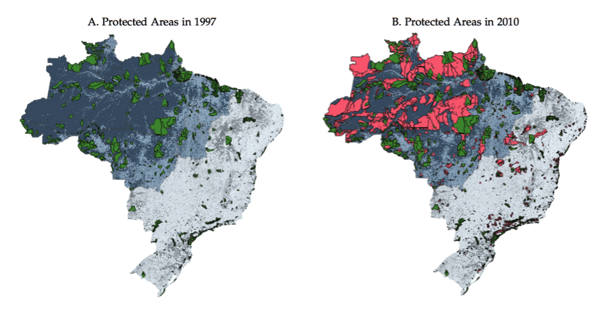
Property right assignment reduces land related conflict. Using this variation in the municipal share of land with contestable title in the Brazilian Amazon, we show that (in)secure property rights are strongly associated with land related conflict. We obtain these results using classical panel data regression methods, but also employ a novel quasi-event study approach.

Effects on deforestation and land use change. Our empirical results on land conflict suggest that the creation of protected areas and indigenous areas, should have distinct effects on land use: since its not attractive to develop a land claim on protected land or land, where title has been given to indigenous groups, there should be limited incentives to invest in the land by deforestation.

There are two distinct channels: permanent deforestation of the type associated with cropland conversion should be dramatically reduced; temporary deforestation, such as due to illegal logging may actually increase if protection is not associated with significant increases in enforcement capacity.

Measuring deforestation and land use change. On the Amazon frontier, it is difficult to obtain reliable statistics about crop production or simple cattle ranching, as a lot of the farming is subsistence farming at small scale. Hence, official agricultural statistics are unlikely to be very useful to document changes in land use. In our paper, we invoke a very simple machine learning method to infer land use change based on k-means clustering of sequences of land use based on pixel level classifications based on MODIS land use product . We sampled roughly 800,000 randomly selected points across the Amazon and developed a pixel level panel for these points, exploring the pattern of land use. Over a five year period a sequence of land use could look like:

Forest – Forest  – Shrubland – Shrubland – Cropland

is indicative of permanent  land use change towards farmland, while a sequence such as

Forest – Shrubland  – Shrubland - Forest – Forest

may be indicative of temporary deforestation, followed by forest regrowth. The larger the state space (i.e. the larger the individual set of land use classes), the more difficult does it become to classify individual sequences of land use. For example with 10 different states, there are 10^5  possible combinations. This is where dimensionality reduction as carried out by k-means clustering can help, by clustering or grouping sequences that are similar based on some numeric features.

While in the end, we decided to use a very simplified state space with only three states: Forest, Cropland and Shrubland the method is nevertheless instructive and useful for simple applications like this.

The Features that we use are simple counts, such as the number of transitions to the state of being Forested or away from the state of being Forested (MODIS Land use category <=5), to the state of being Cropland (MODIS land use category 12/ 14) or the length that a pixel is classified as shrub land (in between cropland and forested). In addition, we count the length of repeat patterns, such as SCSC which may indicate crop rotation.

The separation achieved using R’s built in kmeans() function with different number of clusters with the different numeric features is illustrated below:

Numeric Features used for k-means clustering, cluster results and separation achieved.

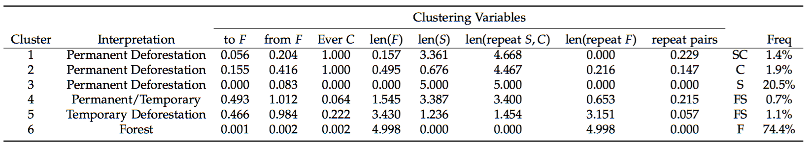
We can look at the individual clusters and then it is up to the researcher to decide upon how to interpret the resulting clusters. In our case, there was a clear separation into two clusters that indicate permanent deforestation as 100% of the sequences falling in that category had been classified as cropland at least once. There is an inbetween class, a class that indicates clearly temporary deforestation due to patterns of forest regrowth and a category that rests somewhere in between temporary and permanent.

Lastly, the big cluster consists of the bulk of pixels that are always forested.

Permanent vs Temporary and Forest Use

Our results , based on a simple difference in difference analysis as well as a matching difference in difference (as e.g. carried out by Chris Nolte and many others), suggests that pixels that become protected are more likely to remain in a forested state after a protected area is established.

In terms of permanent and temporary deforestation, our results suggest that – while permanent deforestation goes down, temporary land use patterns actually seem to become more likely.  This could suggest that environmental protection may induce some behavioural changes at the margin, whereby settlers, rather than trying to develop legal claims over land actually just turn to extract the natural resources on the land and move on. Naturally, such behavior is much more difficult to prevent through policing and enforcement efforts.

References

Assunção, J., & Rocha, R. (2014). Getting Greener by Going Black : The Priority Municipalities in Brazil. Mimeo.

Hidalgo, F. D., Naidu, S., Nichter, S., & Richardson, N. (2010). Economic Determinants of Land Invasions. Review of Economics and Statistics, 92(3), 505–523. http://doi.org/10.1162/REST_a_00007

Espírito-Santo, F. D. B., Gloor, M., Keller, M., Malhi, Y., Saatchi, S., Nelson, B., … Phillips, O. L. (2014). Size and frequency of natural forest disturbances and the Amazon forest carbon balance. Nature Communications, 5, 3434. http://doi.org/10.1038/ncomms4434

Fetzer, T. R. (2014). Social Insurance and Conflict: Evidence from India. Mimeo.

Fetzer, T. R., & Marden, S. (2016). Take what you can: property rights, contestability and conflict.

Morton, D. C., DeFries, R. S., Shimabukuro, Y. E., Anderson, L. O., Arai, E., del Bon Espirito-Santo, F., … Morisette, J. (2006). Cropland expansion changes deforestation dynamics in the southern Brazilian Amazon. Proceedings of the National Academy of Sciences of the United States of America, 103(39), 14637–14641.

Did the weather affect the #Brexit vote?

On the evening of the polling day, some parts of London and southern England were hit by very bad weather, while other areas experienced nice weather with high temperatures and sunshine. The weather could have affected the Brexit vote by affecting Turnout or by affecting Voting Intentions.

To cut a long story short: there is, using very crude data, no evidence suggesting that the rainfall affected turnout. There is weak evidence, suggesting that the good weather in parts of the country, may have induced some voters to vote leave in the “heat of the moment”. But: overall, its unlikely that this would have changed the results.

The Brexit voters had an overall decisive lead with more than a million votes. Nevertheless, it would be interesting to see whether the “Great British Summer” contributed to the result. Further, there is quite a bit of serious economics research that document relationships, for example between rainfall and conflict, or between temperatures and aggressive behavior. But how could the weather have affected the Brexit vote?

Polling on a working day Coming from Germany, it struck me as extremely odd, why polls would take place on Thursdays – a working day. I feel that this is one of those odd English institutions or traditions created by the elites to – de-facto – limit the franchise of the working class. Naturally, it is much more difficult for the (commuting) employed  to cast their vote, as they have to do it, a) either in advance through a postal vote, b) in the morning or evening hours, which coincide with the commuting hours or, c) during the day or their lunch break. However, commuting makes it difficult as voters can register only at one polling station to cast their vote.

The opportunity cost of voting is unevenly distributed. The retired or unemployed, who turned out to be, on average more likely to vote Brexit had lower opportunity cost of voting. The uneven distribution of the opportunity cost of voting due to polling on a working day could have affected the electoral outcome, as voters who are young (and employed) were more likely to vote remain.

Come the weather. London, and some parts of the south saw in less than 24 hours, the amount of rainfall that usually falls within a whole month (see BBC article below). The reason, why I thought that the weather could have affected the Brexit vote is simple. Several parts of the South of England, the commuting belt around London, was affected by severe weather on the 23rd – both in the morning and the evening. Having lived and commuted from Guildford for a year, I know how painful the commute is. You may leave work, get drenched and wet along the way and then, get stuck in Waterloo or Victoria station, where there are few trains running. By the time you get home, you really may not have the energy to get up and vote. Especially since during the day, the markets were trending up, potentially suggesting that Bremain would be a done deal.  The current #Bregret wave on Twitter also suggests, that some voters simply didnt take things serious and may have decided not to vote, as the sun was out in some parts of England. 

Flooded Southern Train track
Flooded Southern Train track taken from BBC , http://www.bbc.co.uk/news/uk-36603508

London and the South, one of the few islands of strong Bremain support experienced a months rainfall within 24 hours. Its not unreasonable to assume that the bad weather could, for all these mixtures of reasons, conributed to the voting outcome

So what do the data say? The results of the referendum, broken up by Local Authority Districts is published on the electoral commission website.

This data can easily be downloaded and loaded into R (dropbox link with all data and code). What turned out to be much more difficult to get is very recent weather data – and maybe that is something, where this analysis still has lots of room for improvement. The only data that I could find that is recent enough is from the following MET Office data sharing service.

The data sharing service provides hourly observation data for 135 weather stations in the UK. Unfortunately, it does not provide the amount of rainfall in mm, but rather, just a categorization of the weather condition into classes such as

Screen Shot 2016-06-26 at 09.17.20

In addition, the data provides the temperature, wind speed and pressure. I construct a variable that measures the number of hours in which the weather was classified as “Heavy Rain” or  involved “Thunder”. Similarly, I construct daily averages of temperature.

Matching Local Authority Districts to weather points. As indicated, the weather data leaves a lot of room for improvement due to its coarseness and if you have any further data suggestions, let me know. I assign a weather observation, for which I have the latitude and longitude to the centroid of the nearest Local Authority District. I obtained a shapefile of Local Authority Districts covering just England.

Did the weather affect the referendum? There are at least two margins. First, the weather could affect turn out, as suggested above. Second, the weather could affect the mood. Lastly, the weather could have no effect overall.

Did the weather affect turnout? Probably not. The first set of regressions just explores the number of hours it rained during the day, the number of hours it rained in the morning and afternoon/ evening, the last puts both together. Further, I include the average temperature as regressor. Also, I include for Region fixed effect and the regressions are estimated just off English data, for which I could match the data to a shapefile. Throughout, no statistical association between rainfall and turnout appears in the data. This being said, the rainfall proxy is very crude, while temperature is more precisely measured. And here is at least a weak association suggesting that a 1 degree increase in mean temperature, reduced turnout by 0.35 percentage points. But the coefficient is too imprecise for any meaningful association.

summary(felm(Pct_Turnout ~ rainingcommuting23 + rainingnoncommuting23+ temp23 | Region | 0 | id, data=MERGED))
## 
## Call:
##    felm(formula = Pct_Turnout ~ rainingcommuting23 + rainingnoncommuting23 +      temp23 | Region | 0 | id, data = MERGED) 
## 
## Residuals:
##       Min        1Q    Median        3Q       Max 
## -0.142857 -0.026002  0.003213  0.027800  0.127797 
## 
## Coefficients:
##                        Estimate Cluster s.e. t value Pr(>|t|)
## rainingcommuting23    -0.001257     0.002663  -0.472    0.637
## rainingnoncommuting23  0.001951     0.002007   0.972    0.332
## temp23                -0.003253     0.002660  -1.223    0.222
## 
## Residual standard error: 0.04087 on 308 degrees of freedom
##   (62 observations deleted due to missingness)
## Multiple R-squared(full model): 0.3352   Adjusted R-squared: 0.3114 
## Multiple R-squared(proj model): 0.008567   Adjusted R-squared: -0.02684 
## F-statistic(full model, *iid*):14.12 on 11 and 308 DF, p-value: < 2.2e-16 
## F-statistic(proj model): 0.7966 on 3 and 308 DF, p-value: 0.4965

We can perform a type of placebo, by checking whether weather conditions on the day before the referendum had an effect. The only coefficient that gets anywhere close is rainfall during commuting hours on the day before. But again, there is a lack of precision. In any case, ideally finer data at the polling station level in addition to finer weather data is needed.

summary(felm(Pct_Turnout ~ rainingcommuting22 + rainingnoncommuting22+ temp22 | Region | 0 | id, data=MERGED))
## 
## Call:
##    felm(formula = Pct_Turnout ~ rainingcommuting22 + rainingnoncommuting22 +      temp22 | Region | 0 | id, data = MERGED) 
## 
## Residuals:
##       Min        1Q    Median        3Q       Max 
## -0.154669 -0.026714  0.003494  0.028441  0.115703 
## 
## Coefficients:
##                         Estimate Cluster s.e. t value Pr(>|t|)
## rainingcommuting22     4.440e-03    3.680e-03   1.207    0.229
## rainingnoncommuting22 -1.467e-05    2.594e-03  -0.006    0.995
## temp22                 4.816e-04    9.895e-04   0.487    0.627
## 
## Residual standard error: 0.04091 on 308 degrees of freedom
##   (62 observations deleted due to missingness)
## Multiple R-squared(full model): 0.3338   Adjusted R-squared:  0.31 
## Multiple R-squared(proj model): 0.006468   Adjusted R-squared: -0.02902 
## F-statistic(full model, *iid*):14.03 on 11 and 308 DF, p-value: < 2.2e-16 
## F-statistic(proj model): 0.7678 on 3 and 308 DF, p-value: 0.5128

Did the weather affect voting behavior?
There is a bit more here, the below regression suggest that higher temperatures were correlated with a higher percentage for the vote leave campaign. The turnout regressions suggested a potentially weakly lower turn out, as temperatures are higher. So did high temperatures induce Bremain voters to vote for Brexit?

The point estimate on temperature “temp23” significant at the 5% level, suggesting that a 1 degree increase in the temperature increased Brexit votes by 1 percentage point. This is a lot, but could just be a false positive – i.e. a statistical error. Nevertheless, maybe thats why there is so much to #Bregret? Did the heat of the moment induce voters to make a decision that they now regret?

summary(felm(Pct_Leave ~ rainingcommuting23 + rainingnoncommuting23+ temp23 | Region | 0 | id, data=MERGED))
## 
## Call:
##    felm(formula = Pct_Leave ~ rainingcommuting23 + rainingnoncommuting23 +      temp23 | Region | 0 | id, data = MERGED) 
## 
## Residuals:
##      Min       1Q   Median       3Q      Max 
## -30.9663  -5.2630   0.1153   5.8665  27.1071 
## 
## Coefficients:
##                       Estimate Cluster s.e. t value Pr(>|t|)  
## rainingcommuting23     -0.5980       0.4794  -1.248   0.2132  
## rainingnoncommuting23  -0.3900       0.3903  -0.999   0.3185  
## temp23                  1.1350       0.4935   2.300   0.0221 *
## ---
## Signif. codes:  0 '***' 0.001 '**' 0.01 '*' 0.05 '.' 0.1 ' ' 1
## 
## Residual standard error: 8.104 on 308 degrees of freedom
##   (62 observations deleted due to missingness)
## Multiple R-squared(full model): 0.3729   Adjusted R-squared: 0.3505 
## Multiple R-squared(proj model): 0.0276   Adjusted R-squared: -0.007127 
## F-statistic(full model, *iid*):16.65 on 11 and 308 DF, p-value: < 2.2e-16 
## F-statistic(proj model):  2.47 on 3 and 308 DF, p-value: 0.06201

In order to gain a bit more confidence, we can check whether the weather conditions on the day before. Throughout, there is no indication that this was the case (see below).

summary(felm(Pct_Leave ~ rainingcommuting22 + rainingnoncommuting22+ temp22 | Region | 0 | id, data=MERGED))
## 
## Call:
##    felm(formula = Pct_Leave ~ rainingcommuting22 + rainingnoncommuting22 +      temp22 | Region | 0 | id, data = MERGED) 
## 
## Residuals:
##      Min       1Q   Median       3Q      Max 
## -31.3071  -5.0842   0.5469   5.2357  30.5874 
## 
## Coefficients:
##                       Estimate Cluster s.e. t value Pr(>|t|)
## rainingcommuting22      0.4547       0.7448   0.610    0.542
## rainingnoncommuting22  -0.2837       0.5679  -0.500    0.618
## temp22                  0.1565       0.3447   0.454    0.650
## 
## Residual standard error: 8.208 on 308 degrees of freedom
##   (62 observations deleted due to missingness)
## Multiple R-squared(full model): 0.3567   Adjusted R-squared: 0.3338 
## Multiple R-squared(proj model): 0.00249   Adjusted R-squared: -0.03314 
## F-statistic(full model, *iid*):15.53 on 11 and 308 DF, p-value: < 2.2e-16 
## F-statistic(proj model): 0.211 on 3 and 308 DF, p-value: 0.8888

What can we take from this?I was concinced that I could document an effect of rainfall during the commuting hours. Having experienced the Waterloo commute for a year, I could sympathize with the idea of not going to vote after a long day and a terrible commute. The retired can go vote any time during the day, why the commuters/ employed need to arrange this for the evening or mornign hours. Is this fair or de-facto disenfranchising a set of voters? With the crude data on rainfall, I do not find any evidence in support of the rainfall channel. This would have been policy relevant.

The temperature regressions indicate some weak evidence on voting behavior, suggesting higher Brexit vote share, but no statistically discernible effect on turn out.

There are a lot of buts and ifs here. The analysis is super coarse, but potentially with finer polling data, an actual analysis of commuting flows and better weather data, some points could be driven home.

Maybe that is just my attempt to cope with the Brexit shock. As a German living and working in the UK, I am quite shocked and devastated and worried about what the future holds for me, my partner and my friends here.

Thiemo Fetzer, Assistant Professor in Economics, University of Warwick.

Dropbox Link with all data and code


Correction For Spatial And Temporal Auto-Correlation In Panel Data: Using R To Estimate Spatial HAC Errors Per Conley

Darin Christensen and Thiemo Fetzer


tl;dr: Fast computation of standard errors that allows for serial and spatial auto-correlation.


Economists and political scientists often employ panel data that track units (e.g., firms or villages) over time. When estimating regression models using such data, we often need to be concerned about two forms of auto-correlation: serial (within units over time) and spatial (across nearby units). As Cameron and Miller (2013) note in their excellent guide to cluster-robust inference, failure to account for such dependence can lead to incorrect conclusions: “[f]ailure to control for within-cluster error correlation can lead to very misleadingly small standard errors…” (p. 4).

Conley (1999, 2008) develops one commonly employed solution. His approach allows for serial correlation over all (or a specified number of) time periods, as well as spatial correlation among units that fall within a certain distance of each other. For example, we can account for correlated disturbances within a particular village over time, as well as between that village and every other village within one hundred kilometers. As with serial correlation, spatial correlation can be positive or negative. It can be made visually obvious by plotting, for example, residuals after removing location fixed effects.

Example Visualization of Spatial Correlation
Example Visualization of Spatial Correlation from Radil, S. Matthew, Spatializing Social Networks: Making Space for Theory In Spatial Analysis, 2011.

We provide a new function that allows R users to more easily estimate these corrected standard errors. (Solomon Hsiang (2010) provides code for STATA, which we used to test our estimates and benchmark speed.) Moreover using the excellent lfe, Rcpp, and RcppArmadillo packages (and Tony Fischetti’s Haversine distance function), our function is roughly 20 times faster than the STATA equivalent and can scale to handle panels with more units. (We have used it on panel data with over 100,000 units observed over 6 years.)

This demonstration employs data from Fetzer (2014), who uses a panel of U.S. counties from 1999-2012. The data and code can be downloaded here.


STATA Code:

We first use Hsiang’s STATA code to compute the corrected standard errors (spatHAC in the output below). This routine takes just over 25 seconds.

cd "~/Dropbox/ConleySEs/Data"
clear; use "new_testspatial.dta"

tab year, gen(yy_)
tab FIPS, gen(FIPS_)

timer on 1
ols_spatial_HAC EmpClean00 HDD yy_*FIPS_2-FIPS_362, lat(lat ) lon(lon ) t(year) p(FIPS) dist(500) lag(5) bartlett disp

# *-----------------------------------------------
# *    Variable |   OLS      spatial    spatHAC
# *-------------+---------------------------------
# *         HDD |   -0.669     -0.669     -0.669
# *             |    0.608      0.786      0.838

timer off 1
timer list 1
#  1:     24.8 /        3 =      8.2650

R Code:

Using the same data and options as the STATA code, we then estimate the adjusted standard errors using our new R function. This requires us to first estimate our regression model using the felm function from the lfe package.

# Loading sample data:
dta_file <- "~/Dropbox/ConleySEs/Data/new_testspatial.dta"
DTA <-data.table(read.dta(dta_file))
setnames(DTA, c("latitude", "longitude"), c("lat", "lon"))

# Loading R function to compute Conley SEs:
source("~/Dropbox/ConleySEs/ConleySEs_17June2015.R")

ptm <-proc.time()

# We use the felm() from the lfe package to estimate model with year and county fixed effects.
# Two important points:
# (1) We specify our latitude and longitude coordinates as the cluster variables, so that they are included in the output (m).
# (2) We specify keepCx = TRUE, so that the centered data is included in the output (m).

m <-felm(EmpClean00 ~HDD -1 |year +FIPS |0 |lat +lon,
  data = DTA[!is.na(EmpClean00)], keepCX = TRUE)

coefficients(m) %>%round(3) # Same as the STATA result.
   HDD 
-0.669 

We then feed this model to our function, as well as the cross-sectional unit (county FIPS codes), time unit (year), geo-coordinates (lat and lon), the cutoff for serial correlation (5 years), the cutoff for spatial correlation (500 km), and the number of cores to use.

SE <-ConleySEs(reg = m,
    unit = "FIPS", 
    time = "year",
    lat = "lat", lon = "lon",
    dist_fn = "SH", dist_cutoff = 500, 
    lag_cutoff = 5,
    cores = 1, 
    verbose = FALSE) 

sapply(SE, sqrt) %>%round(3) # Same as the STATA results.
        OLS     Spatial Spatial_HAC 
      0.608       0.786       0.837 
proc.time() -ptm
   user  system elapsed 
  1.619   0.055   1.844 

Estimating the model and computing the standard errors requires just over 1 second, making it over 20 times faster than the comparable STATA routine.


R Using Multiple Cores:

Even with a single core, we realize significant speed improvements. However, the gains are even more dramatic when we employ multiple cores. Using 4 cores, we can cut the estimation of the standard errors down to around 0.4 seconds. (These replications employ the Haversine distance formula, which is more time-consuming to compute.)

pkgs <-c("rbenchmark", "lineprof")
invisible(sapply(pkgs, require, character.only = TRUE))

bmark <-benchmark(replications = 25,
  columns = c('replications','elapsed','relative'),
  ConleySEs(reg = m,
    unit = "FIPS", time = "year", lat = "lat", lon = "lon",
    dist_fn = "Haversine", lag_cutoff = 5, cores = 1, verbose = FALSE),
  ConleySEs(reg = m,
    unit = "FIPS", time = "year", lat = "lat", lon = "lon",
    dist_fn = "Haversine", lag_cutoff = 5, cores = 2, verbose = FALSE),
  ConleySEs(reg = m,
    unit = "FIPS", time = "year", lat = "lat", lon = "lon",
    dist_fn = "Haversine", lag_cutoff = 5, cores = 4, verbose = FALSE))
bmark %>%mutate(avg_eplased = elapsed /replications, cores = c(1, 2, 4))
  replications elapsed relative avg_eplased cores
1           25   23.48    2.095      0.9390     1
2           25   15.62    1.394      0.6249     2
3           25   11.21    1.000      0.4483     4

Given the prevalence of panel data that exhibits both serial and spatial dependence, we hope this function will be a useful tool for applied econometricians working in R.


Feedback Appreciated: Memory vs. Speed Tradeoff

This was Darin’s first foray into C++, so we welcome feedback on how to improve the code. In particular, we would appreciate thoughts on how to overcome a memory vs. speed tradeoff we encountered. (You can email Darin at darinc[at]stanford.edu.)

The most computationally intensive chunk of our code computes the distance from each unit to every other unit. To cut down on the number of distance calculations, we can fill the upper triangle of the distance matrix and then copy it to the lower triangle. With [math]N[/math] units, this requires only  [math](N (N-1) /2)[/math] distance calculations.

However, as the number of units grows, this distance matrix becomes too large to store in memory, especially when executing the code in parallel. (We tried to use a sparse matrix, but this was extremely slow to fill.) To overcome this memory issue, we can avoid constructing a distance matrix altogether. Instead, for each unit, we compute the vector of distances from that unit to every other unit. We then only need to store that vector in memory. While that cuts down on memory use, it requires us to make twice as many   [math](N (N-1))[/math]  distance calculations.

As the number of units grows, we are forced to perform more duplicate distance calculations to avoid memory constraints – an unfortunate tradeoff. (See the functions XeeXhC and XeeXhC_Lg in ConleySE.cpp.)


sessionInfo()
R version 3.2.2 (2015-08-14)
Platform: x86_64-apple-darwin13.4.0 (64-bit)
Running under: OS X 10.10.4 (Yosemite)

locale:
[1] en_GB.UTF-8/en_GB.UTF-8/en_GB.UTF-8/C/en_GB.UTF-8/en_GB.UTF-8

attached base packages:
[1] stats     graphics  grDevices utils     datasets  methods  
[7] base     

other attached packages:
 [1] RcppArmadillo_0.5.400.2.0 Rcpp_0.12.0              
 [3] geosphere_1.4-3           sp_1.1-1                 
 [5] lfe_2.3-1709              Matrix_1.2-2             
 [7] ggplot2_1.0.1             foreign_0.8-65           
 [9] data.table_1.9.4          dplyr_0.4.2              
[11] knitr_1.11               

loaded via a namespace (and not attached):
 [1] Formula_1.2-1    magrittr_1.5     MASS_7.3-43     
 [4] munsell_0.4.2    xtable_1.7-4     lattice_0.20-33 
 [7] colorspace_1.2-6 R6_2.1.1         stringr_1.0.0   
[10] plyr_1.8.3       tools_3.2.2      parallel_3.2.2  
[13] grid_3.2.2       gtable_0.1.2     DBI_0.3.1       
[16] htmltools_0.2.6  yaml_2.1.13      assertthat_0.1  
[19] digest_0.6.8     reshape2_1.4.1   formatR_1.2     
[22] evaluate_0.7.2   rmarkdown_0.8    stringi_0.5-5   
[25] compiler_3.2.2   scales_0.2.5     chron_2.3-47    
[28] proto_0.3-10    

Leveraging R for Econ Job Market


[UPDATE] I just was told that the new features on EJM actually allow you to download an XLS spreadsheet of the job listings on EJM. This is accessible when you login to myeconjobmarket.org and is part of their new AIMS (Application and Interview Management System).

I wanted to describe a little helper I am using to help refine the places I want to apply at since I am going to be on the Economics Job Market this year.

The two main websites were job openings are advertised are:

Now JOE has a really nice feature where you can download simply all job openings into a nice spreadsheet. This allows you to browse through and refine your search. Econ Job Market does not have such a feature.

The Listing page is quite annoying…

ejm-listing


If you want more details for a job opening, such as a description of the fields and application requirements, you will have to click on “more info…”. In the JOE spreadsheet, you have all that information at once.

I wanted to create a JOE like spreadsheet using the openings from EJM. Some of which, of course, do overlap. But for some reason, some jobs are only on EJM but not on JOE.

So how can we use R to help us do that?

The first thing I wanted to do is get the simple listings on the main application page from EJM as a spreadsheet. You can simply download the main listings file and extract the pieces of information. Most important is the “posid” field, which is the position ID contained in the EJM URL. This will give you a direct link to the HTML page of the job opening and it also tells you whether you can apply through EJM.

This leaves you with a listing of EJM links to jobs, their position ID and the EJM Application Link in case the Job Opening accepts applications through EJM. Now you can proceed to simply download all the HTML files using a batch downloader such as DownThemAll. If you want to do that, you can print out a list:

cat(EJM$url, sep="\n")

and enter them into Down Them All. Alternatively you can iterate through the list of links and send HTTP queries to get the details from each job separately. This is part of the next lines of code:

This renders us with a nice csv that we can browse quickly through in Excel…for convenience you can download the listings as of 23-10-2014 below. Good luck for your applications!

econjobmarket-23-10-2014

Is rainfall reporting endogenous to conflict?

For my paper on the impact of social insurance on the dynamics of conflict in India, I use some new remote sensed weather data. The data comes from the Tropical Rainfall Measuring Mission (TRMM) satellites. The satellite carries a set of five instruments, and is essentially a rainfall radar located in outer space.

As a robustness check I needed to verify that my main results go through using other rainfall data. In the paper I try to make a humble case in favour of using remote sensed data where possible. The key reason being that the  TRMM data comes from the same set of instruments over time, rather than from input sources that could be varying with e.g., economic conditions. This is a problem that has been identified by climatologist, who try to correct for systematic biases that could arise from the fact that weather stations are more likely to be located in places with a lot of economic activity.

At first I was a bit reluctant as it is quite heavy data that needs to be processed. Nevertheless, thorough analysis required me to jump the hoop and obtain secondary rainfall data sources. I chose the GPCC monthly rainfall data for verification of my results, since these have been used by many other authors in the past in similar contexts. The data is based on rain gauge measurements and is available for the past 100 years.

The raw data is quite heavy ; the monthly rainfall rate data  for the whole world at at 0.5 degree resolution would amount to about 150 million rows of data for the period from 1961-2010. If you drop the non-land grid cells, this reduces the size dramatically to only 40 million rows. Below is a bit of code that   loads in the data once you have downloaded the ASCII source files from the GPCC website. On my personal website, I make a dta and an rdata file available for the whole world. There are three variables appearing in that order: (1) the rainfall rate, (2) the rainfall normals and (3) an integer that gives the number of reporting rain gauges that fall in a grid cell in a particular month.

It turns out that all my results are robust to using this data. However, I do find something that is quite neat. It turns out that, if a district experienced some insurgency related conflict in the previous year,  it is less likely that this district has an active rain gauge reporting data in subsequent years. While it is a no-brainer that places with severe conflict do not have functioning weather reporting, these results suggest  that reporting may also be systematically affected in places with relatively low intensity of conflict – as is the case of India.

While I do not want to overstate the importance of this, it provides another justification of why it makes sense for economists to be using  remotely sensed weather data. This is not to say that ground based data is not useful. Quite the reverse, ground based data is more accurate in many ways, which makes it very important for climatologist. As economist, we are worried about systematic measurement error that correlates with the economic variables we are studying. This is were remote sensed data provides advantages as it does not “decide” to become less accurate in places that are e.g. less developed, suffer from conflict or simply, have nobody living there.

Here the function to read in the data and match to district centroids, you need some packages.

#########LOAD GPPC NOTE THAT YOU NEED TO SUBSET 
THE DATA IF YOU DONT WANT TO END UP WITH A HUGE 
DATA OBJECT

loadGPCC<-function(ff, COORDS) {
yr<-as.numeric(gsub("(.*)\\_([0-9]{2})([0-9]{4})","\\3",ff))
month<-as.numeric(gsub("(.*)\\_([0-9]{2})([0-9]{4})","\\2",ff))
temp<-data.table(data.frame(cbind(COORDS,
read.table(file=paste("Rainfall/gpcc_full_data_archive_v006_05_degree_2001_2010/",
ff,sep=""), header=FALSE, skip=14))))

###YOU COULD SUBSET THE DATA BY EXTENT HERE IF 
YOU DONT WANT TO GET IT FOR THE WHOLE WORLD
##E.G. SUBSET FOR BY BOUNDING BOX
##temp<-temp[x>=73 & x<=136 & y>=16 & y<=54]

temp<-cbind("year"= yr, "month"=month, temp)
gc("free")
temp
}

################
#####
ffs<-list.files("Rainfall/
gpcc_full_data_archive_v006_05_degree_2001_2010")

###THIS DEFINES THE GRID STRUCTURE OF THE DATA
###YOU MAY NEED TO ADJUST IF YOU WORK WITH A 
COARSER GRID
xs=seq(-179.75,179.75,.5)
ys=seq(89.75,-89.75,-.5)
COORDS<-do.call("rbind", lapply(ys, function(x) cbind("x"=xs,"y"=x)))

system.time(GPCC<-do.call("rbind", lapply(1:length(ffs), function(x) loadGPCC(ffs[x], COORDS))))

###MATCHING THIS TO SHAPEFILE?
##YOU COULD MATCH CENTROIDS OF DISTRICTS TO THE 
NEAREST GRID CELL - THE FOLLOWING FUNCTION WOULD 
DO THAT

###find nearest lat / lon pair
##you may want to vectorise this
NEAREST<-NULL
for(k in 1:nrow(CENTROIDS)) {
cat(k," ")
temp<-distHaversine(CENTROIDS[k,c("x","y"),with=F], 
GPCC.coords[, c("delx","dely"), with=F])
NEAREST<-rbind(NEAREST, cbind(CENTROIDS[k],GPCC.coords[which(temp==
min(temp))]))

}


Stacking Regressions: Latex Tables with R and stargazer

In my paper on the impact of the shale oil and gas boom in the US, I run various instrumental variables specifications. For these, it is nice to stack the regression results one on the other – in particular, to have one row for the IV results, one row for the Reduced Form and maybe one row for plain OLS to see how the IV may turn coefficients around.

I found that as of now – there is no way to do that directly; please correct me if I am wrong.

The layout I have in mind is as in the screenshot of my table.

Sample Table with Stacked Regression Results In Stata, this can be accomplished through the use of esttab with the fragment, and append feature. This appends successive rows to an existing table and you can label the rows using the “refcat” option.

However, in R this is not possible as of yet. I have mainly worked with stargazer, as Marek has added felm objects for high dimensional fixed effects to be handled by his stargazer package.

The following functions are a “hack” that extracts the particular rows from the generated latex code by the stargazer package.

You can then piece the table together by combining the individual elements. The idea is that you have a single stargazer command that is passed to the various functions that extract the different features. Obviuously, this can be done a lot more elegant as the code is extremely hacky, but it does work

Marek has said that he is thinking of incorporating a stacking option into stargazer, but for now, my hack works reasonably well. The key thing to realise is that stargazer calls have the option to return

The following character strings can be used in the table.layout and omit.table.layout arguments of the stargazer command.

“-“ single horizontal line
“=” double horizontal line
“-!” mandatory single horizontal line
“=!” mandatory double horizontal line
“l” dependent variable caption
“d” dependent variable labels
“m” model label
“c” column labels
“#” model numbers
“b” object names
“t” coefficient table
“o” omitted coefficient indicators
“a” additional lines
“n” notes
“s” model statistics


The following functions will simply extract the rows that are being returned.

stargazer.keepcolnums<-function(call="") {
command<-gsub("\\)$",", table.layout='#'\\)",command)
call<-eval(parse(text=command))
bounds<-grep("tabular",call)
row1<- call[(bounds[1]+1):(bounds[2]-1)]
row1<-gsub("^\\\\\\\\\\[-1\\.8ex\\]\\\\hline $", "", row1)
row1<-gsub("^\\\\hline \\\\\\\\\\[-1\\.8ex\\] $","",row1)
row1<-row1[row1!=""]
}
stargazer.keeprow<-function(call="") {
command<-gsub("\\)$",", table.layout='t'\\)",command)
call<-eval(parse(text=command))
bounds<-grep("tabular",call)
row1<- call[(bounds[1]+1):(bounds[2]-1)]
row1<-gsub("^\\\\\\\\\\[-1\\.8ex\\]\\\\hline $", "", row1)
row1<-gsub("^\\\\hline \\\\\\\\\\[-1\\.8ex\\] $","",row1)
row1<-row1[row1!=""]
}

stargazer.keepstats<-function(call="") {
command<-gsub("\\)$",", table.layout='s'\\)",command)
call<-eval(parse(text=command))
row1<-gsub("(.*)\\\\\\\\\\[-1\\.8ex\\](.*)(\\\\end\\{tabular\\})(.*)","\\2",paste(call,collapse=" "))
row1
}
stargazer.begintable<-function(call="") {
command<-gsub("\\)$",", table.layout='m'\\)",command)
call<-eval(parse(text=command))
row1<-paste("\\begin{tabular}",gsub("(.*)\\\\begin\\{tabular\\}(.*)(\\\\end\\{tabular\\})(.*)","\\2",paste(call,collapse="\n")),sep="")
row1
}
stargazer.varlabels<-function(call="") {
command<-gsub("\\)$",", table.layout='d'\\)",command)
call<-eval(parse(text=command))
row1<-paste("\\begin{tabular}",gsub("(.*)\\\\begin\\{tabular\\}(.*)(\\\\end\\{tabular\\})(.*)","\\2",paste(call,collapse="\n")),sep="")
row1
}

stargazer.keepcollabels<-function(call="") {
command<-gsub("\\)$",", table.layout='c'\\)",command)
call<-eval(parse(text=command))
row1<-gsub("(.*)\\\\\\\\\\[-1\\.8ex\\](.*)(\\\\end\\{tabular\\})(.*)","\\2",paste(call,collapse=" "))
row1
}

stargazer.keepomit<-function(call="") {
command<-gsub("\\)$",", table.layout='o'\\)",command)
call<-eval(parse(text=command))
row1<-gsub("(.*)\\\\\\\\\\[-1\\.8ex\\](.*)(\\\\end\\{tabular\\})(.*)","\\2",paste(call,collapse="\n"))
row1
}

It easiest to see how you can use these functions to construct stacked regression output by giving a simple example.

###the global command to be passed to the hacky ###functions that extract the individual bits
## OLS is a list of OLS results from running the
## lfe command
command<-'stargazer(OLS , keep=c("post08shale:directutilityshare","post08shale"), covariate.labels=c("Energy Intensity x Shale","Shale"), header=FALSE, out.header=FALSE, keep.stat=c("n","adj.rsq"))'

begintable<-stargazer.begintable(command)
###some multicolumn to combine 
collcombine<-c("& \\multicolumn{4}{c}{Tradable Goods Sector Only} & \\multicolumn{3}{c}{Additional Sectors} & \\cmidrule(lr){2-5} \\cmidrule(lr){6-8}")
collabel<-stargazer.keepcollabels(command)
colnums<-stargazer.keepcolnums(command)
##plain OLS row
row1<-stargazer.keeprow(command)
##the stats part for the OLS (number of Obs, R2)
stats<-stargazer.keepstats(command)
##the rows for the Fixed effect indicators
omitted<-stargazer.keepomit(command)

##the IV command passing a list of IV results in ## IV object
command<-'stargazer(IV , keep=c("post08anywell:directutilityshare","post08anywell"), covariate.labels=c("Energy Intensity x Anywell","Anywell"), header=FALSE, out.header=FALSE, keep.stat=c("n","adj.rsq"))'

##IV row
row2<-stargazer.keeprow(command)
footer<-c("\\end{tabular}\n" )

###now combine all the items
cat(begintable,collcombine,collabel,colnums,"\\hline \\\\\\emph{Reduced Form} \\\\",row1,""\\hline \\\\\\emph{Reduced Form} \\\\",row2,stats,"\\hline\\hline",footer, file="Draft/tables/energyintensity.tex", sep="\n")

I know the solution is a bit hacky, but it works and does the trick.


Fracking and House Prices on the Marcellus Shale

Starting last summer I worked on a short project that set out to estimate the potential costs of externalities due to unconventional shale gas production in the Marcellus shale on local house prices using a dataset of roughly 150,000 recently sold houses in Ohio, West Virginia and Pennsylvania.

The data suggests that proximity to a natural gas well is correlated with lower housing prices, which confirms previous studies.

fracking-houseprices

I stopped working on a project that looks at the impact of nearby shale gas extraction on property prices for the Marcellus shale. Instead, I focused on my paper “Fracking Growth” that evaluates the employment consequences of the shale oil and gas boom in the US more generally.

Everybody can have a look at the data and the document as it stands on sharelatex, where I also tried Sharelatex’s Knitr capacities, which are still somewhat limited as a lot of R-packages I usually work with are not yet installed.

The public sharelatex file, the data and the R script can be accessed here:

https://www.sharelatex.com/project/534d232b32ed2b25466b2541?r=6f73efc4&rs=ps&rm=d

Here are some preliminary snippets. The data used in this study comes from Zillow.com In Fall 2013 I downloaded data for recently sold houses. I focused the download to cover all or most of the counties that are somewhat near the Marcellus shale in West Virginia, Ohio and Pennsylvania. This list goes back to 2011 and provides data for 151,156 sold properties.

load(file = "HOUSES.rdata")
library(xtable)
table(HOUSES$year)
####  2011  2012  2013
#### 40087 63248 47821

A simple tabulation suggests that most data is for 2012.

Some characteristics that are included in the data are the sale price in USD, the number of bedrooms, number of bathrooms, the built up land size in square feet, the year the property was built and for some properties also the lot size.

The properties have geo-coordinates, which are used to intersect the location of the property with census-tract shapefiles. This will allow the adding of further characteristics at the census-tract level to control for general local characteristics.

The geo-coordinates are further used to compute the exact distance of a property to the nearest actual or permitted well in the year that the property was sold. Distances are computed in meters by computing the Haversine distance on a globe with radius r = 6378137 meters.

The following graph plots the average price per square foot as a function of distance to the nearest well in the year in which the property was sold. I group distances into 500 meter bins.

plot(HOUSES[, list(soldprice =sum(soldprice)/sum(sqft)), by=distancecat ], xlab="Distance to Well", ylab="Price per sqft")

A first inspection suggests a positive gradient in distance, that is – however, quite non-monotone.

Non-monotonic relationship between distance to the nearest oil or gas well and price per sqft.

Does this relationship hold up when running a hedonic pricing regression?

[math]log(y_{ict}) = \gamma \times welldistance_{i} + \beta \times X_i + a_c + \eta_t + e_{ict}[/math]

These are estimated using the lfe package, as I introduce quite demanding fixed effects (census-tract and county by year). The lfe package takes these fixed effects out iteratively before running the actual regression on the demeaned data.

The results for two chosen bandwidths are presented in the table below. There appears to be a positive gradient – being further away from a well correlates with higher prices per square foot.

Regression results comparing sold houses nearby unconventional gas wells on the Marcellus shale

Clearly, the important question is whether one can separate out the property price appreciation that is likely to happen due to the local economic boom from the price differentials that may arise due to the presence of the local externalities and whether, one can separate out externalities due to environmental degradation as distinct from price differentials arising due to factors discussed in the beginning: no access to mortgage lending or insurances.

Unfortunately, I do not have the time to spend more time on this now, but I think a short paper is still feasible…


Mobility from Mobile Phones

I have worked on big data in my work with QuBit in London. In my research I increasingly find the tools I learnt there to be extremely useful. The keywords are smart data management for big data, such as hadoop and hive for querying just the right set of data to work with. I am currently working on Mobile Phone usage data provided by Orange Senegal as part of their data for development challenge. The scope for using big data for development is immense. Many African countries have seen extremely rapid urbanization, essentially moving from an agrarian economy straight into a service sector economy. Mobile technology is being developed in tech hubs across Africa, be it in Dar Es Salaam, Nairobi or in Dakar. Mobile money is a revolution in itself.

Development planning in Africa can not rely on tools used in developed countries: there are for example, no sophisticated traffic monitoring systems in place to help planners keep track of traffic flows, dispatch police units to congested spots. Mobile phone usage data may turn out to be an incredibly useful tool for development planners as it theoretically allows an analysis of human mobility along the mobile phone mast network. This allows planners to get a sense of population density and how population moves within an urban setting. This may help in development planning, but can turn out to be useful on many other dimensions. For example, epidemiological models of disease may make find in mobile phone data a useful input to model spread of diseases.

In any case, there is little economics literature that has worked with mobile phone use data so far. The two constraints are, first, getting the data in the first place and second, how to work with true “big data”. I have submitted a proposal for the Orange Data for Development Challenge Senegal and obtained the mobile phone Call Detail Records data. This is data collected by mobile phone companies for billing purposes and basically records, for every user, when and where (at which mobile phone tower) they have used their phone, either by receiving or making a call or by receiving or sending a text message. The result is three datasets made available to researchers. The datasets are based on Call Detail Records (CDR) of phone calls and text exchanges between more than 9 million of Orange’s customers in Senegal between January 1, 2013 to December 31, 2013. The datasets are: (1) antenna-to-antenna traffic for 1666 antennas on an hourly basis, (2) fine-grained mobility data on a rolling 2-week basis for a year with bandicoot behavioral indicators at individual level for about 300,000 randomly sampled users, (3) one year of coarse-grained mobility data at arrondissement level with bandicoot behavioral indicators at individual level for about 150,000 randomly sampled users.

I want to fine tune into the Dakar region. The capital is capturing most of mobile phone users and its most interesting to study mobility there. This constraints the focus on the fine-grained mobility data for rolling 2 week time windows. Just to get a sense of the type of data we are talking about. Suppose that every of the 300,000 users received was active in every hour of the time window, so that it is a truely balanced hourly panel, the resulting dataset would have 100.8 million rows. It is not possible to hold such amounts of data in the working memory on a conventional computer running Stata. R is a lot more capable to work with big data.

First, R provides the necessary architecture to run certain routines for efficient data processing directly using C code. This ensures that big R data objects are not moved around in the working memory, but that operations are done using the “physical storage” address of the data using C pointers. Most prominently the R package “dplyr” developed by Hadley Wickham is extremely useful as it allows running operations on these very huge data frames in just a few seconds.

I just wanted highlight here the approach I have taken so far in converting the unwieldy data objects into something useable. The idea is first, to zoom in to the Dakar region. This part is only a small share when it comes to comparing with the size of the country, but it absorbs most of the mobile phone users that are sampled. Out of 300,000 sampled users, on average 120,000 or 40% are located in the Dakar region.

senegal-dakar

Dakar Region only small in size relative to rest of the country

The accumulation of users in the Dakar region implies that there the mobile phone network is quite dense. In total there are 1666 antennas reported, but 489, or 29.3% of these antennas are clustered in the Dakar region.

dakar

Dakar Region and Mobile Phone Network Masts with overlayed .01 degree grid

The idea will be to construct measures of mobility at a spatial resolution. A user will only be registered in the antenna that he or she is locked in. Some antennas are extremely close to one another. In order to get a continous measure across space I compute a grid and associate grid cells with mobile phone masts. The above picture is of a 0.01 degree grid (roughly 1 km since we are not far from the equator). Leaving out the Bambilor arrondisement in Rufisque department (the big and sparse chunk on the right), almost every grid cell contains a mobile phone mast.

The first approach I have taken is to get a sense of population density: where are people usually located in the morning, evening and afternoon hours. The idea is that, especially, the location in the evening hours is the place in which individuals live (spend the night so to say). The location during the day may reflect the location where individuals are working. To highlight how this looks, consider the picture below. This plots out the average evening location of individuals in the central capital region. This information is displayed in two ways. First, the grid cell coloring is related to the number of people inside that grid cell, on average, for the evening hours in a two week time window. Second, the red dots indicate individual locations. If people were only logged in to one mobile phone mast every evening, then this would show up as a cluster of points around the mobile phone mast. In this case, the information at the grid level is useful. The fact that we see many individual red dots suggests that also in the evening, there is some mobility even if it is only within a grid cell.

Location of Population in Evening Hours

Average Location of Mobile Phone Users in Evening Hours

We can construct crude average morning, afternoon and evening locations. This then allows a construction of a measure of average mobility during the day time in a two week time window. The distances travelled can be visually plotted.

The figure below is a first attempt. This is obviously ongoing research…

travelling4

Mobility of Individuals in Dakar: Lines indicate straight line travel distances from the average morning, afternoon and evening location.

Regressions with Multiple Fixed Effects – Comparing Stata and R

In my paper on the impact of the recent fracking boom on local economic outcomes, I am estimating models with multiple fixed effects. These fixed effects are useful, because they take out, e.g. industry specific heterogeneity at the county level – or state specific time shocks.

The models can take the form:

[math]y_{cist} = \alpha_{ci} + b_{st} + \gamma_{it}+ X_{cist}'\beta + \epsilon_{cist}[/math]  

where [math]\alpha_{ci}[/math] is a set of county-industry, [math]b_{ci}[/math] a set of state-time and [math]\gamma_{it}[/math] is a set of industry-time fixed effects.

Such a specification takes out arbitrary state-specific time shocks and industry specific time shocks, which are particularly important in my research context as the recession hit tradable industries more than non-tradable sectors, as is suggested in Mian, A., & Sufi, A. (2011). What Explains High Unemployment ? The Aggregate Demand Channel.

How can we estimate such a specification?
Running such a regression in R with the lm or reg in stata will not make you happy, as you will need to invert a huge matrix. An alternative in Stata is to absorb one of the fixed-effects by using xtreg or areg. However, this still leaves you with a huge matrix to invert, as the time-fixed effects are huge; inverting this matrix will still take ages.

However, there is a way around this by applying the Frisch-Waugh Lovell theorem iteratively (remember your Econometrics course?); this basically means you iteratively take out each of the fixed effects in turn by demeaning the data by that fixed effect. The iterative procedure is described in detail in Gaure (2013), but also appears in Guimaraes and Portugal(2010).

Simen Gaure has developed an R-package called lfe, which performs the demeaning for you and also provides the possibility to run instrumental variables regressions; it theoretically supports any dimensionality of fixed effects. The key benefit of Simen Gaure’s implementation is the flexibility, the use of C in the background for some of the computing and its support for multicore processing, which speeds up the demeaning process dramatically, especially the larger your samples get..

In Stata there is a package called reg2hdfe and reg3hdfe which has been developed by Guimaraes and Portugal (2010). As the name indicates, these support only fixed effects up to two or three dimensions.

Lets see how – on the same dataset – the runtimes of reg2hdfe and lfe compare.

Comparing Performance of Stata and R

I am estimating the following specification

[math]y_{cist} = \alpha_{ci} + b_{sit} + \gamma_{it}+ X_{cist}'\beta + \epsilon_{cist}[/math]  

where [math]\alpha_{ci}[/math] is a set of county-industry, [math]b_{ci}[/math] a set of state-time fixed effects. There are about 3000 counties in the dataset and 22 industries. Furthermore, there are 50 states and the time period is also about 50 quarters. This means – in total – there are 3000 x 22 = 66,000 county-industry fixed effects to be estimated and 22 x 50 x 50 = 55,000 time fixed effects to be estimated. The sample I work with has sufficient degrees of freedom to allow the estimation of such a specification – I work with roughly 3.7 million observations.

I have about 10 covariates that are in [math]X_{cist}[/math], i.e. these are control variables that vary within county x industry over state x industry x time.

Performance in Stata

In order to time the length of a stata run, you need to run
set rmsg on, which turns on a timer for each command that is run.

The command I run in stata is

reg2hdfe logy x1-x10,  id1(sitq ) id2(id) cluster(STATE_FIPS )

You should go get a coffee, because this run is going to take quite a bit of time. In my case, it took t=1575.31, or just about 26 minutes.

Performance in R 
In order to make the runs of reg2hdfe and lfe, we need to set the tolerance level of the convergence criterion to be the same in both. The standard tolerance in Stata is set at $$1e^{-6}$$, while for lfe package it is set at $$1e^{-8}$$. In order to make the runs comparable you can set the options in the R package lfe options explicitly:

options(lfe.eps=1e-6)

The second change we need to make is to disallow lfe to use multiple cores, since reg2hdfe uses only a single thread. We can do this by setting:

options(lfe.threads=1)

Now lets run this in R using:

system.time(summary(felm(log(y) ~ x1 + x2 +x3 +x4 + x5 + x6 + x7 +x8 + x9 + x10 + G(id)+G(sitq),
data=EMP, cluster=c("STATE_FIPS"))))

The procedure converges in a lot quicker than Stata…

 user system elapsed 
208.450 23.817 236.831 

It took a mere 4 minutes. Now suppose I run this in four separate threads…

user system elapsed 
380.964 23.540 177.520


Running this on four threads saves about one minute in processing time; not bad, but not too much gained; the gains from multi-threading increase, the more fixed-effects are added and the larger the samples are.

Computing Maritime Routes in R

Thanks to the attention my paper on the cost of Somali piracy has received, a lot of people have approached me to ask how I computed the maritime routes. It is not a very difficult task using R. The key ingredient is a map of the world, that can be rasterized into a grid; all the landmass needs to be assigned an infinite cost of crossing and last but not least — one needs to compute the actual routes.

What packages do I need?

library(gdistance)
library(maptools)
data(wrld_simpl)
library(data.table)

The package gdistance does most of the actual work of computing the routes. The wrld_simpl map provides what is needed to generate a raster.

Generating a Raster

#create a raster from shape files
shp <- wrld_simpl
r <- raster()
r <-rasterize(shp, r, progress='text')

After the raster is generated, we can proceed by making landmass impassable for vessels.

#make all sea = -999
r[is.na(r)] <- -999
#this turns all landmass to missing
r[r>-999] <- NA
#assign unit cost to all grid cells in water
r[r==-999] <- 1

There are a few more things to do, such as opening up the Suez Canal and some other maritime passages — one needs to find the right grid cells for this task. In the next step we can transform the raster into a transition layer matrix, that comes from the gdistance package. It is a data construct that essentially tells us how one can move from one cell to the other — you can allow diagonal moves by allowing the vessel to move into all 8 adjacent grid cells. There is also a geo-correction necessary, as the diagonals are longer distances than the straight-line moves.

tr <- transition(r, mean, directions = 8)
tr <- geoCorrection(tr, "c")

Well — and thats basically it — of course, there are a few bits and pieces that need additional work — like adding heterogenuous costs as one can imagine exist due to maritime currents and so on. Furthermore, there is a whole logic surrounding the handling of the output and the storing in a local database for further use and so on.

But not to bore you with that — how can I obtain the distance between A and B? This uses Dijkstra’s Algorithm and is called through the gdistance function “shortestPath”.

AtoB <- shortestPath(tr, as.numeric(start[1:2]), as.numeric(end[1:2]), output = "SpatialLines")

Using this output, you can then generate fancy graphs such as …


Starting Multiple Stata Instances on Mac

I found it useful to have multiple Stata instances running on my Mac, in particular, if I use one instance to clean the data before running merge commands. It is always annoying if the merging does not work out or throws an error and then, one would have to clear the current instance and open the DTA file that was messing up the merge.

Its a simple command that allows you to open multiple Stata instances on a Mac:

open -n /Applications/Stata12_OSX/StataSE.app

You can also define an alias command in your .bash_profile,

alias stata='open -n /Applications/Stata12_OSX/StataSE.app'
Good luck!


Salmon Fishing in Yemen: Somali Piracy and the Fishing industry

We are working on finalizing our paper on Somalian piracy and the effects on the shipping industry. We believe that our paper is the first serious attempt to identify the cost of piracy using a novel dataset and a novel approach. We find that the direct and indirect cost may be between $ 1.8 – $3.0 billion. This is a lot of money compared with the mere $150 – $250 million that the piracy activity generates for the pirates. This highlights how large the welfare gains from having a functioning state with working institutions and an established monopoly of power can be.

Clearly, the paper is not capturing all the adjustments that are taking place. In particular, we find that local and regional trade is a lot stronger affected by piracy then, e.g. trade from Asia to Europe. This suggests that the piracy burden is especially born by regional economies, such as Yemen, Kenya, the Seychelles and so on. This got me thinking and I started looking at the impact of piracy on the fishing industry — I first started off with Yemen, however, the data quality is very poor.

Here is something very primer…The graph depicts quarterly reported fish catches by the Ministry of Fisheries of the Seychelles and the number of piracy attacks in the vicinity of the Seychelles (roughly in a radius of around 500 miles). Do we believe that the rise in piracy was causing this drop in fish catches, which appears to be persistent?

Exploring Heterogenous Treatment Effects: Returns to Capital

Jon de Quidt and I recently looked a bit into the data from the paper of De Mel, Woodruff and McKenzie (2008) in Sri Lanka. It is quite an influential paper, experimentally administering capital shocks to microenterprises in Sri Lanka in order to estimate the returns to capital.

Their paper highlighted that the returns to capital “at the bottom of the Pyramid” could be very large indeed. In their favorite specification they find that these could be as high as 50 – 63 % per year (in real terms). This suggests that these investments pay-off on average. It was one of the first papers that used experimentally generated variation in capital stocks to estimate these returns. Thats why it became so influential and the authors have a set of papers on Mexico and Ghana, performing similar estimates.

They point out that there is a lot of heterogeneity in the estimated treatment effects. In particular, they observe that for female entrepreneurs, there is virtually no (average) treatment effect. This and the reasons that could be underlying this observation are explored in a second paper.

We had a look at the De Mel et al (2008) data, which is available here. We essentially ran their regressions of (reported) real profits on the treatment dummy. However, we did this iteratively for each individual treated person, using the whole group of non-treated individuals as counterfactual. This allow us to get an estimate of the treatment effect for each individual treated.

From this, we get a distribution of treatment effect estimates. The average of this should be the treatment effect that De Mel et al (2008) report in their paper. And indeed it comes quite close. However, what we are intrigued by is the significant heterogeneity in the point estimates for the treatment effect for different individuals.

A key observation is that the treatment effects are very heterogeneous – the mass of enterprises who saw a drop in profits is almost as large as the mass of enterprises that saw a rise, however, some saw a very significant and large rise in real profits. The vertical line is the average of the treatment effect, which here, as we lumped the cash treatments together, is around 900 rupees.  The median treatment effect however, is only  332 rupees. Thats some food for thought.

Histogram and Kernel Density Estimate of Treatment Effects for Cash Treatments