Category Archives: R

Capturing the Brexit vote in data

In my recent research I have worked on understanding the key correlates of Brexit. This paper is joint work with my co-authors Sascha Becker and Dennis Novy and has now been published in Economic Policy. After having gone through the peer-review process, I am very happy to share the data and the underlying code.

On the construction of a rich local authority level dataset

After the EU Referendum, I started working on assembling a dataset to study the question to what extent low turnout among potential remain voters may help to understand the result of the referendum. In particular, back then I looked at the extent to which rainfall may have discouraged people to turn up to vote in the first place. After all, a lot of polls, the financial markets and betting markets seemed to indicate that Remain would win.

It was not inconceivable to imagine that turnout may have been particularly low among a set of voters living in the London commuter belt, who were turned off from voting on a working day after an arduous journey into London that was marred by train cancelations due to the bad weather.

The result then was that there appears to have been a weak effect on turnout, but this effect was not biased in either direction with regard to voter preferences: Remain would have lost also on a sunny day (we confirm this finding in the new paper with a different rainfall data set).

In any case, this was the starting point to a significant data collection effort. In particular we have combined data from all the 380 local authorities in England, Scotland and Wales as well as some data of ward level voting across five cities. The resulting set of covariates is quite sizable and they can be roughly grouped into the following four categories:

  1. characteristics of the underlying economic structure of an area, like the unemployment rate, wages or sectoral employment shares and changes therein,
  2. demographic and human capital characteristics like age structure, education or life satisfaction,
  3. exposure to the EU measured by indicators like the level of EU transfers, trade and the growth rate of immigration from other EU countries,
  4. public service provision and fiscal consolidation that covers the share of public employment, as well as the reduction in public spending per capita among others and NHS performance metrics.

To analyse which of these covariates are strong correlates of the Leave vote share in an area, we used a simple machine-learning method that chooses the best subset of covariates that best predicts the referendum Leave share. The idea is to build a robust predictive model that could achieve significant out of sample prediction accurracy.

More formally, best subset selection solves the following optimization problem to obtain an optimal vector beta that can robustly predict the vote leave share y_c

equations

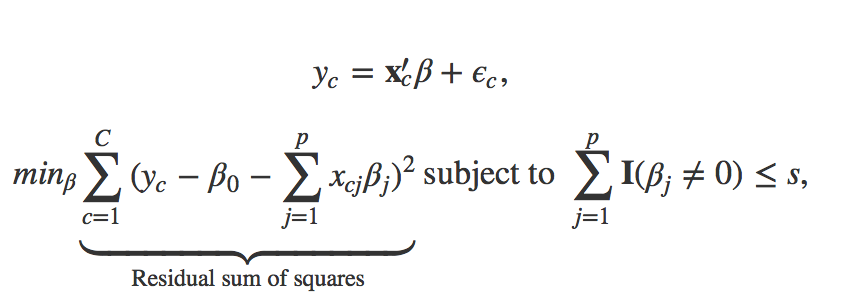
While the formulation may be a bit technical, it boils down to estimating all possible ways to combine regressors. That means, all possible ways of estimating a model that includes 1, 2, 3, …, p covariates are being estimated. This amounts to estimating (2^p) models, which becomes infeasible to estimate very fast. Lasso and other methods such as forward- and backward stepwise selection are solving approximations to the combinatorical problem that BSS solves. The method is usually taught at the beginning of machine learning courses as it provides a great way to illustrate the bias-variance tradeoff.

The result can be summarized in a simple bar chart and is somewhat striking:

 r2regressors

R2 of best models with different groups of regressors

What this suggests is that “Fundamental factors” such economic structure, demographics and human capital are strongest correlates of Leave vote in the UK; the direct level effects of migration and trade exposure captured in the group of regressors called “EU Exposure” seem second order.

Also what is striking that even very simple empirical models with just 10 – 20 variables are doing a good job in capturing the variation in the vote leave share across the whole of the UK.  The best model that includes variables measuring vote shares of different parties (especially UKIP) from the 2014 European Parliamentary election captures 95% of the overall variation.

The observation that variables capturing direct exposure to the European Union, in particular, Immigration seems at odds with voter narratives around the EU referendum, which were doinated by the immigration topic. In fact, the 2015 British Election study suggests that voters  considered immigration to be the single most important issue of the time.

Word clound constructed out of responses to question "what is single most important issue facing country at the time" from the 2015 BES study
Unigram word cloud constructed out of responses to question “what is single most important issue facing country at the time” from the 2015 BES study

In the above the word cloud the keyword immigration is just quite striking. Looking at the bigram word cloud drawn from the British Election study, the themes of the individual responses become even more apparent.

Bigram word cloud constructed out of responses to question "what is single most important issue facing country at the time" from the 2015 BES study
Bigram word cloud constructed out of responses to question “what is single most important issue facing country at the time” from the 2015 BES study

There things like “many people”, “small island”, “uncontrolled immigration” appear in addition to the simple immigration keyword. But also other themes, such as “national debt”, “health service” and concerns about the “welfare system” seem to feature quite large. Overall this suggests that immigration may have been a salient feature in the public debate, but it seems at odds with the fact that the variable groups pertaining to EU immigration seem to capture very little of the variation in the intensity of the leave vote across the UK.


In another paper with Sascha we confirm this observation  in a panel setup. We show  that a local area’s exposure to Eastern European immigration has, at best, only a small impact on anti-EU preferences in the UK as measured by UKIP voting in European Parliamentary Elections.

While our code for the Economic policy paper is implemented in Stata, it is very easy to replicate this work in Stata. Below is an example of how you would implement BSS in R through the leaps package.

The leaps package has a nice visualization of which regressors are included in which of the best models. The below example replicates the results in our Table 1.

library(data.table)
library(haven)
library(leaps)
DTA<-data.table(read_dta(file="data/brexitevote-ep2017.dta"))

#TABLE 1 IN THE PAPER WOULD BE REPLICATED BY RUNNING
TABLE1<-regsubsets(Pct_Leave~InitialEUAccession+MigrantEUAccessionGrowth+InitialOldEUMember+MigrantOldEUMemberGrowth+InitialElsewhere+MigrantElsewhereGrowth+Total_EconomyEU_dependence+eufundspercapitapayment13+EU75Leaveshare,nbest=1,data=DTA)

plot(TABLE1,scale="r2")

 subsets

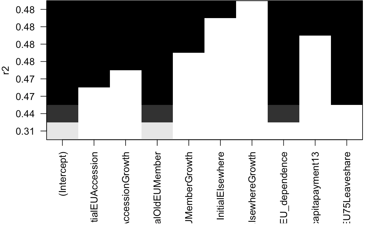
Plotting best subset results

If you want to replicate the word clouds from the 2015 British Election study, the following lines of code will do. You will need to download the British Election Study dataset here.


library(data.table)
library(haven)
library(quanteda)

DTA<-data.table(read_dta(file="data/bes_f2f_original_v3.0.dta"))

C<-corpus(DTA$A1)
docnames(C)<-DTA$finalserialno

C.dfmunigram

C.dfmunigram <- dfm(C, tolower = TRUE, stem = FALSE, removeNumbers=TRUE,removePunct=TRUE, remove = stopwords("english"), ngrams=1)
C.dfm<-dfm(C, tolower = TRUE, stem = FALSE, removeNumbers=TRUE,removePunct=TRUE, remove = stopwords("english"), ngrams=2)

plot(C.dfmunigram)

plot(C.dfm)

this
 

UK 2017 General Election Results Data

As the reality of a hung parliament starts to sink in, economists, political scientists and commentators will begin their usual routine of “post mortem” analysis of the surprise result of the UK 2017 general election. My co-authors Sascha Becker and Dennis Novy have done a similar exercise studying the EU Referendum last year [see also here]  and have worked on the question whether migration contributed to an erosion of pro EU sentiment [see also here].

For people wanting to get to work straight away, there are a few things slowing us down.  The last constituency, Kensington, was not called until last night and so I dont expect the UK’s Election Commission to post the final tally of votes across all constituencies anytime before next week. Nevertheless, the crude election results data can be “scraped” from some infographics. This post describes how…

The Economist’s Infographics

The Economist, among other newspapers, provides a very nice infographic – behind that info graphic lies a web service that can be queried using JSON formed requests.

Economist Magazine Infographic presenting UK 2017 Election Results

Each Parliamentary constituency has an identifier code that can be used to query the web service and pull the results. The URL for a request is quite simple:

http://infographics.economist.com/2017/ukelmap-2017/data/live-results2017/r2017E14000937.json

This provides the results for the constituency Cambridgeshire, South East. The JSON object looks as follows

resultCB({"swing": -3.84, "mpn": "Lucy Frazer", "electorate": "86121", "lib": 11958, "id": "E14000937", "name": "Cambridgeshire, South East", "lab": 17443, "con": 33601, "status": "hold", "pa_key": "123", "oth": 0, "region": "East Of England", "win": "con", "turnout": "63002"})

This piece of Javascript calls a function resultCB that updates one of the views of the infographic.

In order to convert this to an R data frame, we can use the RJSONIO or jsonlite package functions fromJSON, after having removed the part that calls the function, i.e.

library(jsonlite)
as.data.frame(fromJSON(gsub("\\)$","",gsub("resultCB\\(","",readLines(con="http://infographics.economist.com/2017/ukelmap-2017/data/live-results2017/r2017E14000937.json")))))
##          id pa_key oth                       name win status swing   lib
## 1 E14000937    123   0 Cambridgeshire, South East con   hold -3.84 11958
##            region         mpn electorate turnout   lab   con
## 1 East Of England Lucy Frazer      86121   63002 17443 33601

In order to build a data.frame of all election results, all that is necessary is to loop over the set of constituency codes available. I share the results from this step in the following spreadsheet Data for UK 2017 General Election Results (Economist Infographic).

Using R to study the Yemen Conflict with night light images

The Yemeni civil war has received very little attention despite the growing humanitarian disaster. There is a lack of reliable figures on the extent of the human suffering in Yemen. The few data that is available suggests that it is immense. According to the UN, from March 2015 to August 2016, over 10,000 people have been killed in Yemen, including 3,799 civilians.

This note asks whether high frequency satellite images do capture the extent to which conflict is ongoing in Yemen and asks in particular, whether there is distinct geographic variation suggesting which areas are most affected by the ongoing conflict.

Can the effect and the spatial incidence of the conflict in Yemen be traced through satellite images?

Satellite images have been used to study urban sprawl and general economic growth and development. The extent to which satellite images can be used to study man-made disasters such as conflicts is not widely explored.

There are lots of other papers that have used various night light data sets to study urbanization, ethnic favoritism, and economic growth (see Henderson et al, 2012 ; Michalopoulos and Papaioannou 2013,  Hodler and Raschky, 2014).

In related work Fetzer et al., 2016, I studied the extent to which light emissions in the early 1990s can be used to obtain a measure of the extent of power rationing in Colombia following El-Nino induced droughts. In another project, we use the DMSP night light images to study the evolution of cities over time and how democratization can change the relative distribution of cities Fetzer and Shanghavi, 2015.

Since 2012, the VIIRS
high frequency and high resolution satellite images capturing night lights emissions are available from NASA’s Earth Observation Group. They have now been made available for analysis on Google’s Earth Engine, making them much more accessible to the wider research audience.

Lets have a look at night light Yemen before and after the Saudi Arabian military intervention.

yemen-after
Average VIIRS lights after the Saudi intervention in Yemen started.
yemen-before
Average VIIRS lights for the period before the Saudi intervention in Yemen.

The light scales are identical, indicating that relative to the border with Saudi Arabia, the night light emissions from Yemen have dropped dramatically, especially around the capital city Sana’a. The circular blobs indicated are around the main oil/ gas producing parts of Yemen, where there may be light emissions due to flaring of natural gas.

A minimal average light emissions of 0.5 was imposed
Zooming in to Sana’a, the figures look as follows.

sanaa-after
Average light emissions from Sana’a since the Saudi intervention in Yemen started.


sanaa-before
Average light emissions from Sana’a for period before the Saudi intervention in Yemen.

Having a look at the data

library(data.table)
library(foreign)
library(plyr)
library(parallel)

options(stringsAsFactors = FALSE)
setwd("/Users/thiemo/Dropbox/Research/Yemen")

# A DATA SET OF 34k populated places (or historically populated places)
YE <- data.table(read.csv(file = "~/Dropbox/Research/Yemen/Yemen-Cities.csv"))

# LIGHTS DATA IS FROM VIIRS Images made availabe on the Google Earth Engine
LIGHTS <- data.table(read.csv(file = "~/Dropbox/Research/Yemen/lightsall.csv"))

LIGHTS[, `:=`(year, as.numeric(substr(system.index, 1, 4)))]
LIGHTS[, `:=`(month, as.numeric(substr(system.index, 5, 6)))]
LIGHTS[, `:=`(.geo, NULL)]
LIGHTS[, `:=`(UFI, NULL)]
LIGHTS[, `:=`(LONGITUDE, NULL)]

LIGHTS[, `:=`(date, strptime(paste(year, month, "01", sep = "-"), "%Y-%m-%d"))]

LIGHTS <- join(LIGHTS, YE)
## Joining by: rownum

Some simple plots are quite suggestive. The following plots the average light emissions around populated places over time by month. The date of the intervention onset, which coincides with the date of the fall of Sana’a coincides with dramatic drop in light emissions.

Average lights dropped by a almost 2/3, suggesting a stand still in economic activity. Overall light emissions are still visible as indicated in the graphs suggesting that the places do not turn pitch black. The

plot(LIGHTS[, mean(list), by = date], type = "l")

before-after

The Distributional Effects of the Conflict

The Houthi movement has been gaining influence over a longer time period. In particular, since the 2012 the Houthi’s have gained influence spreading from North to the South. The European Council of Foreign Relations has produced maps illustrating the spatial expansion of Houthi control in Yemen.

Yemen_Religious

A central question relates to the strategy of the Saudi military intervention. In particular, whether the intervention is aimed at territories that came under Houthi control since 2012 or whether the intervention is targeted at the Houthi-heartland.

A simple exercise that allows this study is to look at the evolution of lights in the northern Houthi-heartland relative to the populated places in the rest of the country that came under Houthi control since 2012.

A definition of what consists of the Houthi-heartland is subject to contention. But a conservative definition may consist of the four governerates Ammran, Sada’ah, Al Jawf and Hajjah.

LIGHTS[, `:=`(HOUTHI, as.numeric(ADM1 %in% c("15", "22", "21", "19")))]
require(ggplot2)
ggplot(LIGHTS[, mean(list), by = c("HOUTHI", "date")], aes(date, V1, colour = as.factor(HOUTHI))) + 
    geom_line() + geom_point() + theme_bw() + theme(legend.position = "bottom")


before-after-2

The summary statistics suggest that in absolute terms much larger in the non-Houthi heartland. Though given that the initial level in the Houthi heartland is much lower, suggesting that that part of the country is much less developed. Given that there is a notional minimum light emissions of zero, this truncation of the data is a concern.

One way around this is to dummify the lights measure and look at whether a populated place is lit above a certain threshold.

LIGHTS[, `:=`(anylit, list > 0.25)]
ggplot(LIGHTS[, mean(anylit), by = c("HOUTHI", "date")], aes(date, V1, colour = as.factor(HOUTHI))) + 
    geom_line() + geom_point() + theme_bw() + theme(legend.position = "bottom")

before-after-3

Again it is hard to see whether there is any divergence in trends in this dummified measure, but this naturally is less prone to be affected by the truncation inherent to this type of data.

A regression with location and time fixed effects that measures whether there was a distinct change in nightlights in places in the Houthi-heartland relative to the non-Houthi heartland suggests that there is indeed a marked difference, indicating that the conflict is concentrated in the non-Houthi heartland.

Definint the discrete variable for a difference in difference estimation and loading the lfe package that allows for high dimensional fixed effects:

LIGHTS[, `:=`(anylit, list > 0.25)]
LIGHTS[, `:=`(postKSAintervention, as.numeric(date > "2015-03-01"))]
library(lfe)
LIGHTS[, `:=`(date, as.factor(date))]

Running the actual difference in difference regressions:

# levels
summary(felm(list ~ postKSAintervention:HOUTHI | rownum + date | 0 | ADM1, data = LIGHTS))
## 
## Call:
##    felm(formula = list ~ postKSAintervention:HOUTHI | rownum + date |      0 | ADM1, data = LIGHTS) 
## 
## Residuals:
##     Min      1Q  Median      3Q     Max 
## -74.347  -0.205   0.043   0.194  82.063 
## 
## Coefficients:
##                            Estimate Cluster s.e. t value Pr(>|t|)  
## postKSAintervention:HOUTHI   0.4184       0.1900   2.202   0.0277 *
## ---
## Signif. codes:  0 '***' 0.001 '**' 0.01 '*' 0.05 '.' 0.1 ' ' 1
## 
## Residual standard error: 1.758 on 1172455 degrees of freedom
## Multiple R-squared(full model): 0.752   Adjusted R-squared: 0.7447 
## Multiple R-squared(proj model): 0.003315   Adjusted R-squared: -0.02603 
## F-statistic(full model, *iid*):  103 on 34519 and 1172455 DF, p-value: < 2.2e-16 
## F-statistic(proj model): 4.848 on 1 and 22 DF, p-value: 0.03846
# dummified measure
summary(felm(anylit ~ postKSAintervention:HOUTHI | rownum + date | 0 | ADM1, 
    data = LIGHTS))
## 
## Call:
##    felm(formula = anylit ~ postKSAintervention:HOUTHI | rownum +      date | 0 | ADM1, data = LIGHTS) 
## 
## Residuals:
##      Min       1Q   Median       3Q      Max 
## -1.12247 -0.10416  0.00593  0.06185  1.06958 
## 
## Coefficients:
##                            Estimate Cluster s.e. t value Pr(>|t|)    
## postKSAintervention:HOUTHI  0.08470      0.02359    3.59  0.00033 ***
## ---
## Signif. codes:  0 '***' 0.001 '**' 0.01 '*' 0.05 '.' 0.1 ' ' 1
## 
## Residual standard error: 0.2223 on 1172455 degrees of freedom
## Multiple R-squared(full model): 0.5762   Adjusted R-squared: 0.5637 
## Multiple R-squared(proj model): 0.008458   Adjusted R-squared: -0.02073 
## F-statistic(full model, *iid*):46.18 on 34519 and 1172455 DF, p-value: < 2.2e-16 
## F-statistic(proj model): 12.89 on 1 and 22 DF, p-value: 0.00163
# taking logs
summary(felm(log(list) ~ postKSAintervention:HOUTHI | rownum + date | 0 | ADM1, 
    data = LIGHTS[!is.infinite(log(list))]))
## 
## Call:
##    felm(formula = log(list) ~ postKSAintervention:HOUTHI | rownum +      date | 0 | ADM1, data = LIGHTS[!is.infinite(log(list))]) 
## 
## Residuals:
##      Min       1Q   Median       3Q      Max 
## -12.8918  -0.3725   0.1060   0.5223   6.5958 
## 
## Coefficients:
##                            Estimate Cluster s.e. t value Pr(>|t|)    
## postKSAintervention:HOUTHI   0.4133       0.1234    3.35 0.000809 ***
## ---
## Signif. codes:  0 '***' 0.001 '**' 0.01 '*' 0.05 '.' 0.1 ' ' 1
## 
## Residual standard error: 0.8958 on 844476 degrees of freedom
##   (327294 observations deleted due to missingness)
## Multiple R-squared(full model): 0.6534   Adjusted R-squared: 0.6393 
## Multiple R-squared(proj model): 0.01248   Adjusted R-squared: -0.02789 
## F-statistic(full model, *iid*):46.12 on 34519 and 844476 DF, p-value: < 2.2e-16 
## F-statistic(proj model): 11.22 on 1 and 22 DF, p-value: 0.002899

An alternative way to study this is by doing a flexible non-parametric estimation to rule out diverging trends prior to the military intervention.

summary(felm(anylit ~ date:HOUTHI | rownum + date | 0 | ADM1, data = LIGHTS))
## 
## Call:
##    felm(formula = anylit ~ date:HOUTHI | rownum + date | 0 | ADM1,      data = LIGHTS) 
## 
## Residuals:
##      Min       1Q   Median       3Q      Max 
## -1.12574 -0.10765  0.00313  0.06437  1.06515 
## 
## Coefficients:
##                       Estimate Cluster s.e. t value Pr(>|t|)    
## date2014-01-01:HOUTHI       NA      0.00000      NA       NA    
## date2014-02-01:HOUTHI  0.01095      0.01320   0.830 0.406641    
## date2014-03-01:HOUTHI  0.03173      0.02764   1.148 0.250884    
## date2014-04-01:HOUTHI  0.11048      0.06028   1.833 0.066814 .  
## date2014-05-01:HOUTHI  0.09762      0.05271   1.852 0.063989 .  
## date2014-06-01:HOUTHI  0.10249      0.05861   1.749 0.080336 .  
## date2014-07-01:HOUTHI  0.07204      0.06053   1.190 0.233987    
## date2014-08-01:HOUTHI  0.06338      0.04866   1.302 0.192778    
## date2014-09-01:HOUTHI  0.03816      0.04690   0.814 0.415860    
## date2014-10-01:HOUTHI  0.04247      0.04359   0.974 0.329930    
## date2014-11-01:HOUTHI  0.05621      0.03646   1.542 0.123115    
## date2014-12-01:HOUTHI  0.02213      0.03037   0.729 0.466205    
## date2015-01-01:HOUTHI -0.02596      0.02585  -1.004 0.315415    
## date2015-02-01:HOUTHI  0.02250      0.05141   0.438 0.661649    
## date2015-03-01:HOUTHI  0.06080      0.05740   1.059 0.289437    
## date2015-04-01:HOUTHI  0.13514      0.04806   2.812 0.004925 ** 
## date2015-05-01:HOUTHI  0.15874      0.04647   3.416 0.000635 ***
## date2015-06-01:HOUTHI  0.15493      0.05151   3.008 0.002632 ** 
## date2015-07-01:HOUTHI  0.12681      0.04697   2.700 0.006944 ** 
## date2015-08-01:HOUTHI  0.12363      0.04319   2.863 0.004202 ** 
## date2015-09-01:HOUTHI  0.13972      0.05276   2.648 0.008088 ** 
## date2015-10-01:HOUTHI  0.13422      0.04697   2.857 0.004273 ** 
## date2015-11-01:HOUTHI  0.12408      0.04566   2.717 0.006578 ** 
## date2015-12-01:HOUTHI  0.12125      0.04505   2.691 0.007119 ** 
## date2016-01-01:HOUTHI  0.11971      0.03905   3.065 0.002176 ** 
## date2016-02-01:HOUTHI  0.11952      0.04151   2.879 0.003984 ** 
## date2016-03-01:HOUTHI  0.12721      0.04239   3.001 0.002693 ** 
## date2016-04-01:HOUTHI  0.12537      0.04532   2.766 0.005669 ** 
## date2016-05-01:HOUTHI  0.12989      0.05297   2.452 0.014209 *  
## date2016-06-01:HOUTHI  0.13070      0.05936   2.202 0.027675 *  
## date2016-07-01:HOUTHI  0.14831      0.06597   2.248 0.024573 *  
## date2016-08-01:HOUTHI  0.13047      0.04614   2.827 0.004693 ** 
## date2016-09-01:HOUTHI  0.14481      0.06024   2.404 0.016227 *  
## date2016-10-01:HOUTHI  0.11782      0.05255   2.242 0.024959 *  
## date2016-11-01:HOUTHI  0.12175      0.04473   2.722 0.006486 ** 
## ---
## Signif. codes:  0 '***' 0.001 '**' 0.01 '*' 0.05 '.' 0.1 ' ' 1
## 
## Residual standard error: 0.2219 on 1172422 degrees of freedom
## Multiple R-squared(full model): 0.5776   Adjusted R-squared: 0.5652 
## Multiple R-squared(proj model): 0.01175   Adjusted R-squared: -0.01738 
## F-statistic(full model, *iid*): 46.4 on 34552 and 1172422 DF, p-value: < 2.2e-16 
## F-statistic(proj model): 147.2 on 35 and 22 DF, p-value: < 2.2e-16

This suggests that the differential drop in lights occured only after March 2015, the month in which Saudi Arabia’s military intervention commenced.

On average, the regressions suggest that the drop in lights was significantly more pronounced outside the Houthi heartland. This suggests that the conflict and the bombing carried out by Saudi Arabia is mostly concentrated outside the Houthi rebel heartland.

That the dramatic drops in light emissions is associated with the Saudi military intervention is quite clear. The conflict between the Houthi rebels and the government had been ongoing for several years but only starting with the intervention of Saudi Arabia do marked differences between Houthi and non-Houthi heartland provinces appear.

This analysis can further be refined by studying the role of the religious make up of different provinces, as the role of the religious make up between Shia and Sunni muslim groups is said to be an important factor driving this conflict.

Nevertheless, this analysis suggests that high frequency satellite images such as these can be useful in assessing the extent to which areas area directly affected by conflict, which may be useful for targeting humanitarian relief.

Land Conflict, Property Rights and Deforestation in Brasil

Weak institutions and natural resource abundance are a recipe for civil conflict and the overexploitation of natural resources.  In our forthcoming paper with the title “Take what you can: property rights, contestability and conflict”, Samuel Marden and I present evidence from Brazil indicating that insecure property rights are a major cause of land related conflict and a contributing factor in Amazon deforestation.

Brasil is a unique context. The contestability of property rights over land is enshrined into the Brazilian constitution. Land not in ‘productive use’ is vulnerable to invasion by squatters, who can develop the land and appeal to the government for title. This setup may cause violent conflict, between squatters and other groups claiming title to land. As such, weak property rights may distinctly affect conflict by directly and indirectly shaping the underlying incentives.  

Protected Areas and Tribal Reserve Areas redefine the “productive use” of land, rendering the land not contestable anymore. We obtain variation in the share of municipal level that is contestable land by exploiting the dramatic expansion in the share of land under ecological or indigenous protection between 1997 and 2010.  An increase in the municipal share of land under protection reduces the share of land in that municipality that is contestable. protected-areas Property right assignment reduces land related conflict. Using this variation in the municipal share of land with contestable title in the Brazilian Amazon, we show that (in)secure property rights are strongly associated with land related conflict. We obtain these results using classical panel data regression methods, but also employ a novel quasi-event study approach.

Effects on deforestation and land use change. Our empirical results on land conflict suggest that the creation of protected areas and indigenous areas, should have distinct effects on land use: since its not attractive to develop a land claim on protected land or land, where title has been given to indigenous groups, there should be limited incentives to invest in the land by deforestation.

There are two distinct channels: permanent deforestation of the type associated with cropland conversion should be dramatically reduced; temporary deforestation, such as due to illegal logging may actually increase if protection is not associated with significant increases in enforcement capacity.

Measuring deforestation and land use change. On the Amazon frontier, it is difficult to obtain reliable statistics about crop production or simple cattle ranching, as a lot of the farming is subsistence farming at small scale. Hence, official agricultural statistics are unlikely to be very useful to document changes in land use. In our paper, we invoke a very simple machine learning method to infer land use change based on k-means clustering of sequences of land use based on pixel level classifications based on MODIS land use product . We sampled roughly 800,000 randomly selected points across the Amazon and developed a pixel level panel for these points, exploring the pattern of land use. Over a five year period a sequence of land use could look like:

Forest – Forest  – Shrubland – Shrubland – Cropland

is indicative of permanent  land use change towards farmland, while a sequence such as

Forest – Shrubland  – Shrubland - Forest – Forest

may be indicative of temporary deforestation, followed by forest regrowth. The larger the state space (i.e. the larger the individual set of land use classes), the more difficult does it become to classify individual sequences of land use. For example with 10 different states, there are 10^5  possible combinations. This is where dimensionality reduction as carried out by k-means clustering can help, by clustering or grouping sequences that are similar based on some numeric features.

While in the end, we decided to use a very simplified state space with only three states: Forest, Cropland and Shrubland the method is nevertheless instructive and useful for simple applications like this.

The Features that we use are simple counts, such as the number of transitions to the state of being Forested or away from the state of being Forested (MODIS Land use category <=5), to the state of being Cropland (MODIS land use category 12/ 14) or the length that a pixel is classified as shrub land (in between cropland and forested). In addition, we count the length of repeat patterns, such as SCSC which may indicate crop rotation.

The separation achieved using R’s built in kmeans() function with different number of clusters with the different numeric features is illustrated below:

Numeric Features used for k-means clustering, cluster results and separation achieved.

We can look at the individual clusters and then it is up to the researcher to decide upon how to interpret the resulting clusters. In our case, there was a clear separation into two clusters that indicate permanent deforestation as 100% of the sequences falling in that category had been classified as cropland at least once. There is an inbetween class, a class that indicates clearly temporary deforestation due to patterns of forest regrowth and a category that rests somewhere in between temporary and permanent.

Lastly, the big cluster consists of the bulk of pixels that are always forested.

Permanent vs Temporary and Forest Use

Our results , based on a simple difference in difference analysis as well as a matching difference in difference (as e.g. carried out by Chris Nolte and many others), suggests that pixels that become protected are more likely to remain in a forested state after a protected area is established.

In terms of permanent and temporary deforestation, our results suggest that – while permanent deforestation goes down, temporary land use patterns actually seem to become more likely.  This could suggest that environmental protection may induce some behavioural changes at the margin, whereby settlers, rather than trying to develop legal claims over land actually just turn to extract the natural resources on the land and move on. Naturally, such behavior is much more difficult to prevent through policing and enforcement efforts.

References

Assunção, J., & Rocha, R. (2014). Getting Greener by Going Black : The Priority Municipalities in Brazil. Mimeo.

Hidalgo, F. D., Naidu, S., Nichter, S., & Richardson, N. (2010). Economic Determinants of Land Invasions. Review of Economics and Statistics, 92(3), 505–523. http://doi.org/10.1162/REST_a_00007

Espírito-Santo, F. D. B., Gloor, M., Keller, M., Malhi, Y., Saatchi, S., Nelson, B., … Phillips, O. L. (2014). Size and frequency of natural forest disturbances and the Amazon forest carbon balance. Nature Communications, 5, 3434. http://doi.org/10.1038/ncomms4434

Fetzer, T. R. (2014). Social Insurance and Conflict: Evidence from India. Mimeo.

Fetzer, T. R., & Marden, S. (2016). Take what you can: property rights, contestability and conflict.

Morton, D. C., DeFries, R. S., Shimabukuro, Y. E., Anderson, L. O., Arai, E., del Bon Espirito-Santo, F., … Morisette, J. (2006). Cropland expansion changes deforestation dynamics in the southern Brazilian Amazon. Proceedings of the National Academy of Sciences of the United States of America, 103(39), 14637–14641.

Did the weather affect the #Brexit vote?

On the evening of the polling day, some parts of London and southern England were hit by very bad weather, while other areas experienced nice weather with high temperatures and sunshine. The weather could have affected the Brexit vote by affecting Turnout or by affecting Voting Intentions.

To cut a long story short: there is, using very crude data, no evidence suggesting that the rainfall affected turnout. There is weak evidence, suggesting that the good weather in parts of the country, may have induced some voters to vote leave in the “heat of the moment”. But: overall, its unlikely that this would have changed the results.

The Brexit voters had an overall decisive lead with more than a million votes. Nevertheless, it would be interesting to see whether the “Great British Summer” contributed to the result. Further, there is quite a bit of serious economics research that document relationships, for example between rainfall and conflict, or between temperatures and aggressive behavior. But how could the weather have affected the Brexit vote?

Polling on a working day Coming from Germany, it struck me as extremely odd, why polls would take place on Thursdays – a working day. I feel that this is one of those odd English institutions or traditions created by the elites to – de-facto – limit the franchise of the working class. Naturally, it is much more difficult for the (commuting) employed  to cast their vote, as they have to do it, a) either in advance through a postal vote, b) in the morning or evening hours, which coincide with the commuting hours or, c) during the day or their lunch break. However, commuting makes it difficult as voters can register only at one polling station to cast their vote.

The opportunity cost of voting is unevenly distributed. The retired or unemployed, who turned out to be, on average more likely to vote Brexit had lower opportunity cost of voting. The uneven distribution of the opportunity cost of voting due to polling on a working day could have affected the electoral outcome, as voters who are young (and employed) were more likely to vote remain.

Come the weather. London, and some parts of the south saw in less than 24 hours, the amount of rainfall that usually falls within a whole month (see BBC article below). The reason, why I thought that the weather could have affected the Brexit vote is simple. Several parts of the South of England, the commuting belt around London, was affected by severe weather on the 23rd – both in the morning and the evening. Having lived and commuted from Guildford for a year, I know how painful the commute is. You may leave work, get drenched and wet along the way and then, get stuck in Waterloo or Victoria station, where there are few trains running. By the time you get home, you really may not have the energy to get up and vote. Especially since during the day, the markets were trending up, potentially suggesting that Bremain would be a done deal.  The current #Bregret wave on Twitter also suggests, that some voters simply didnt take things serious and may have decided not to vote, as the sun was out in some parts of England. 

Flooded Southern Train track
Flooded Southern Train track taken from BBC , http://www.bbc.co.uk/news/uk-36603508

London and the South, one of the few islands of strong Bremain support experienced a months rainfall within 24 hours. Its not unreasonable to assume that the bad weather could, for all these mixtures of reasons, conributed to the voting outcome

So what do the data say? The results of the referendum, broken up by Local Authority Districts is published on the electoral commission website.

This data can easily be downloaded and loaded into R (dropbox link with all data and code). What turned out to be much more difficult to get is very recent weather data – and maybe that is something, where this analysis still has lots of room for improvement. The only data that I could find that is recent enough is from the following MET Office data sharing service.

The data sharing service provides hourly observation data for 135 weather stations in the UK. Unfortunately, it does not provide the amount of rainfall in mm, but rather, just a categorization of the weather condition into classes such as

Screen Shot 2016-06-26 at 09.17.20

In addition, the data provides the temperature, wind speed and pressure. I construct a variable that measures the number of hours in which the weather was classified as “Heavy Rain” or  involved “Thunder”. Similarly, I construct daily averages of temperature.

Matching Local Authority Districts to weather points. As indicated, the weather data leaves a lot of room for improvement due to its coarseness and if you have any further data suggestions, let me know. I assign a weather observation, for which I have the latitude and longitude to the centroid of the nearest Local Authority District. I obtained a shapefile of Local Authority Districts covering just England.

Did the weather affect the referendum? There are at least two margins. First, the weather could affect turn out, as suggested above. Second, the weather could affect the mood. Lastly, the weather could have no effect overall.

Did the weather affect turnout? Probably not. The first set of regressions just explores the number of hours it rained during the day, the number of hours it rained in the morning and afternoon/ evening, the last puts both together. Further, I include the average temperature as regressor. Also, I include for Region fixed effect and the regressions are estimated just off English data, for which I could match the data to a shapefile. Throughout, no statistical association between rainfall and turnout appears in the data. This being said, the rainfall proxy is very crude, while temperature is more precisely measured. And here is at least a weak association suggesting that a 1 degree increase in mean temperature, reduced turnout by 0.35 percentage points. But the coefficient is too imprecise for any meaningful association.

summary(felm(Pct_Turnout ~ rainingcommuting23 + rainingnoncommuting23+ temp23 | Region | 0 | id, data=MERGED))
## 
## Call:
##    felm(formula = Pct_Turnout ~ rainingcommuting23 + rainingnoncommuting23 +      temp23 | Region | 0 | id, data = MERGED) 
## 
## Residuals:
##       Min        1Q    Median        3Q       Max 
## -0.142857 -0.026002  0.003213  0.027800  0.127797 
## 
## Coefficients:
##                        Estimate Cluster s.e. t value Pr(>|t|)
## rainingcommuting23    -0.001257     0.002663  -0.472    0.637
## rainingnoncommuting23  0.001951     0.002007   0.972    0.332
## temp23                -0.003253     0.002660  -1.223    0.222
## 
## Residual standard error: 0.04087 on 308 degrees of freedom
##   (62 observations deleted due to missingness)
## Multiple R-squared(full model): 0.3352   Adjusted R-squared: 0.3114 
## Multiple R-squared(proj model): 0.008567   Adjusted R-squared: -0.02684 
## F-statistic(full model, *iid*):14.12 on 11 and 308 DF, p-value: < 2.2e-16 
## F-statistic(proj model): 0.7966 on 3 and 308 DF, p-value: 0.4965

We can perform a type of placebo, by checking whether weather conditions on the day before the referendum had an effect. The only coefficient that gets anywhere close is rainfall during commuting hours on the day before. But again, there is a lack of precision. In any case, ideally finer data at the polling station level in addition to finer weather data is needed.

summary(felm(Pct_Turnout ~ rainingcommuting22 + rainingnoncommuting22+ temp22 | Region | 0 | id, data=MERGED))
## 
## Call:
##    felm(formula = Pct_Turnout ~ rainingcommuting22 + rainingnoncommuting22 +      temp22 | Region | 0 | id, data = MERGED) 
## 
## Residuals:
##       Min        1Q    Median        3Q       Max 
## -0.154669 -0.026714  0.003494  0.028441  0.115703 
## 
## Coefficients:
##                         Estimate Cluster s.e. t value Pr(>|t|)
## rainingcommuting22     4.440e-03    3.680e-03   1.207    0.229
## rainingnoncommuting22 -1.467e-05    2.594e-03  -0.006    0.995
## temp22                 4.816e-04    9.895e-04   0.487    0.627
## 
## Residual standard error: 0.04091 on 308 degrees of freedom
##   (62 observations deleted due to missingness)
## Multiple R-squared(full model): 0.3338   Adjusted R-squared:  0.31 
## Multiple R-squared(proj model): 0.006468   Adjusted R-squared: -0.02902 
## F-statistic(full model, *iid*):14.03 on 11 and 308 DF, p-value: < 2.2e-16 
## F-statistic(proj model): 0.7678 on 3 and 308 DF, p-value: 0.5128

Did the weather affect voting behavior?
There is a bit more here, the below regression suggest that higher temperatures were correlated with a higher percentage for the vote leave campaign. The turnout regressions suggested a potentially weakly lower turn out, as temperatures are higher. So did high temperatures induce Bremain voters to vote for Brexit?

The point estimate on temperature “temp23” significant at the 5% level, suggesting that a 1 degree increase in the temperature increased Brexit votes by 1 percentage point. This is a lot, but could just be a false positive – i.e. a statistical error. Nevertheless, maybe thats why there is so much to #Bregret? Did the heat of the moment induce voters to make a decision that they now regret?

summary(felm(Pct_Leave ~ rainingcommuting23 + rainingnoncommuting23+ temp23 | Region | 0 | id, data=MERGED))
## 
## Call:
##    felm(formula = Pct_Leave ~ rainingcommuting23 + rainingnoncommuting23 +      temp23 | Region | 0 | id, data = MERGED) 
## 
## Residuals:
##      Min       1Q   Median       3Q      Max 
## -30.9663  -5.2630   0.1153   5.8665  27.1071 
## 
## Coefficients:
##                       Estimate Cluster s.e. t value Pr(>|t|)  
## rainingcommuting23     -0.5980       0.4794  -1.248   0.2132  
## rainingnoncommuting23  -0.3900       0.3903  -0.999   0.3185  
## temp23                  1.1350       0.4935   2.300   0.0221 *
## ---
## Signif. codes:  0 '***' 0.001 '**' 0.01 '*' 0.05 '.' 0.1 ' ' 1
## 
## Residual standard error: 8.104 on 308 degrees of freedom
##   (62 observations deleted due to missingness)
## Multiple R-squared(full model): 0.3729   Adjusted R-squared: 0.3505 
## Multiple R-squared(proj model): 0.0276   Adjusted R-squared: -0.007127 
## F-statistic(full model, *iid*):16.65 on 11 and 308 DF, p-value: < 2.2e-16 
## F-statistic(proj model):  2.47 on 3 and 308 DF, p-value: 0.06201

In order to gain a bit more confidence, we can check whether the weather conditions on the day before. Throughout, there is no indication that this was the case (see below).

summary(felm(Pct_Leave ~ rainingcommuting22 + rainingnoncommuting22+ temp22 | Region | 0 | id, data=MERGED))
## 
## Call:
##    felm(formula = Pct_Leave ~ rainingcommuting22 + rainingnoncommuting22 +      temp22 | Region | 0 | id, data = MERGED) 
## 
## Residuals:
##      Min       1Q   Median       3Q      Max 
## -31.3071  -5.0842   0.5469   5.2357  30.5874 
## 
## Coefficients:
##                       Estimate Cluster s.e. t value Pr(>|t|)
## rainingcommuting22      0.4547       0.7448   0.610    0.542
## rainingnoncommuting22  -0.2837       0.5679  -0.500    0.618
## temp22                  0.1565       0.3447   0.454    0.650
## 
## Residual standard error: 8.208 on 308 degrees of freedom
##   (62 observations deleted due to missingness)
## Multiple R-squared(full model): 0.3567   Adjusted R-squared: 0.3338 
## Multiple R-squared(proj model): 0.00249   Adjusted R-squared: -0.03314 
## F-statistic(full model, *iid*):15.53 on 11 and 308 DF, p-value: < 2.2e-16 
## F-statistic(proj model): 0.211 on 3 and 308 DF, p-value: 0.8888

What can we take from this?I was concinced that I could document an effect of rainfall during the commuting hours. Having experienced the Waterloo commute for a year, I could sympathize with the idea of not going to vote after a long day and a terrible commute. The retired can go vote any time during the day, why the commuters/ employed need to arrange this for the evening or mornign hours. Is this fair or de-facto disenfranchising a set of voters? With the crude data on rainfall, I do not find any evidence in support of the rainfall channel. This would have been policy relevant.

The temperature regressions indicate some weak evidence on voting behavior, suggesting higher Brexit vote share, but no statistically discernible effect on turn out.

There are a lot of buts and ifs here. The analysis is super coarse, but potentially with finer polling data, an actual analysis of commuting flows and better weather data, some points could be driven home.

Maybe that is just my attempt to cope with the Brexit shock. As a German living and working in the UK, I am quite shocked and devastated and worried about what the future holds for me, my partner and my friends here.

Thiemo Fetzer, Assistant Professor in Economics, University of Warwick.

Dropbox Link with all data and code


Correction For Spatial And Temporal Auto-Correlation In Panel Data: Using R To Estimate Spatial HAC Errors Per Conley

Darin Christensen and Thiemo Fetzer


tl;dr: Fast computation of standard errors that allows for serial and spatial auto-correlation.


Economists and political scientists often employ panel data that track units (e.g., firms or villages) over time. When estimating regression models using such data, we often need to be concerned about two forms of auto-correlation: serial (within units over time) and spatial (across nearby units). As Cameron and Miller (2013) note in their excellent guide to cluster-robust inference, failure to account for such dependence can lead to incorrect conclusions: “[f]ailure to control for within-cluster error correlation can lead to very misleadingly small standard errors…” (p. 4).

Conley (1999, 2008) develops one commonly employed solution. His approach allows for serial correlation over all (or a specified number of) time periods, as well as spatial correlation among units that fall within a certain distance of each other. For example, we can account for correlated disturbances within a particular village over time, as well as between that village and every other village within one hundred kilometers. As with serial correlation, spatial correlation can be positive or negative. It can be made visually obvious by plotting, for example, residuals after removing location fixed effects.

Example Visualization of Spatial Correlation
Example Visualization of Spatial Correlation from Radil, S. Matthew, Spatializing Social Networks: Making Space for Theory In Spatial Analysis, 2011.

We provide a new function that allows R users to more easily estimate these corrected standard errors. (Solomon Hsiang (2010) provides code for STATA, which we used to test our estimates and benchmark speed.) Moreover using the excellent lfe, Rcpp, and RcppArmadillo packages (and Tony Fischetti’s Haversine distance function), our function is roughly 20 times faster than the STATA equivalent and can scale to handle panels with more units. (We have used it on panel data with over 100,000 units observed over 6 years.)

This demonstration employs data from Fetzer (2014), who uses a panel of U.S. counties from 1999-2012. The data and code can be downloaded here.


STATA Code:

We first use Hsiang’s STATA code to compute the corrected standard errors (spatHAC in the output below). This routine takes just over 25 seconds.

cd "~/Dropbox/ConleySEs/Data"
clear; use "new_testspatial.dta"

tab year, gen(yy_)
tab FIPS, gen(FIPS_)

timer on 1
ols_spatial_HAC EmpClean00 HDD yy_*FIPS_2-FIPS_362, lat(lat ) lon(lon ) t(year) p(FIPS) dist(500) lag(5) bartlett disp

# *-----------------------------------------------
# *    Variable |   OLS      spatial    spatHAC
# *-------------+---------------------------------
# *         HDD |   -0.669     -0.669     -0.669
# *             |    0.608      0.786      0.838

timer off 1
timer list 1
#  1:     24.8 /        3 =      8.2650

R Code:

Using the same data and options as the STATA code, we then estimate the adjusted standard errors using our new R function. This requires us to first estimate our regression model using the felm function from the lfe package.

# Loading sample data:
dta_file <- "~/Dropbox/ConleySEs/Data/new_testspatial.dta"
DTA <-data.table(read.dta(dta_file))
setnames(DTA, c("latitude", "longitude"), c("lat", "lon"))

# Loading R function to compute Conley SEs:
source("~/Dropbox/ConleySEs/ConleySEs_17June2015.R")

ptm <-proc.time()

# We use the felm() from the lfe package to estimate model with year and county fixed effects.
# Two important points:
# (1) We specify our latitude and longitude coordinates as the cluster variables, so that they are included in the output (m).
# (2) We specify keepCx = TRUE, so that the centered data is included in the output (m).

m <-felm(EmpClean00 ~HDD -1 |year +FIPS |0 |lat +lon,
  data = DTA[!is.na(EmpClean00)], keepCX = TRUE)

coefficients(m) %>%round(3) # Same as the STATA result.
   HDD 
-0.669 

We then feed this model to our function, as well as the cross-sectional unit (county FIPS codes), time unit (year), geo-coordinates (lat and lon), the cutoff for serial correlation (5 years), the cutoff for spatial correlation (500 km), and the number of cores to use.

SE <-ConleySEs(reg = m,
    unit = "FIPS", 
    time = "year",
    lat = "lat", lon = "lon",
    dist_fn = "SH", dist_cutoff = 500, 
    lag_cutoff = 5,
    cores = 1, 
    verbose = FALSE) 

sapply(SE, sqrt) %>%round(3) # Same as the STATA results.
        OLS     Spatial Spatial_HAC 
      0.608       0.786       0.837 
proc.time() -ptm
   user  system elapsed 
  1.619   0.055   1.844 

Estimating the model and computing the standard errors requires just over 1 second, making it over 20 times faster than the comparable STATA routine.


R Using Multiple Cores:

Even with a single core, we realize significant speed improvements. However, the gains are even more dramatic when we employ multiple cores. Using 4 cores, we can cut the estimation of the standard errors down to around 0.4 seconds. (These replications employ the Haversine distance formula, which is more time-consuming to compute.)

pkgs <-c("rbenchmark", "lineprof")
invisible(sapply(pkgs, require, character.only = TRUE))

bmark <-benchmark(replications = 25,
  columns = c('replications','elapsed','relative'),
  ConleySEs(reg = m,
    unit = "FIPS", time = "year", lat = "lat", lon = "lon",
    dist_fn = "Haversine", lag_cutoff = 5, cores = 1, verbose = FALSE),
  ConleySEs(reg = m,
    unit = "FIPS", time = "year", lat = "lat", lon = "lon",
    dist_fn = "Haversine", lag_cutoff = 5, cores = 2, verbose = FALSE),
  ConleySEs(reg = m,
    unit = "FIPS", time = "year", lat = "lat", lon = "lon",
    dist_fn = "Haversine", lag_cutoff = 5, cores = 4, verbose = FALSE))
bmark %>%mutate(avg_eplased = elapsed /replications, cores = c(1, 2, 4))
  replications elapsed relative avg_eplased cores
1           25   23.48    2.095      0.9390     1
2           25   15.62    1.394      0.6249     2
3           25   11.21    1.000      0.4483     4

Given the prevalence of panel data that exhibits both serial and spatial dependence, we hope this function will be a useful tool for applied econometricians working in R.


Feedback Appreciated: Memory vs. Speed Tradeoff

This was Darin’s first foray into C++, so we welcome feedback on how to improve the code. In particular, we would appreciate thoughts on how to overcome a memory vs. speed tradeoff we encountered. (You can email Darin at darinc[at]stanford.edu.)

The most computationally intensive chunk of our code computes the distance from each unit to every other unit. To cut down on the number of distance calculations, we can fill the upper triangle of the distance matrix and then copy it to the lower triangle. With [math]N[/math] units, this requires only  [math](N (N-1) /2)[/math] distance calculations.

However, as the number of units grows, this distance matrix becomes too large to store in memory, especially when executing the code in parallel. (We tried to use a sparse matrix, but this was extremely slow to fill.) To overcome this memory issue, we can avoid constructing a distance matrix altogether. Instead, for each unit, we compute the vector of distances from that unit to every other unit. We then only need to store that vector in memory. While that cuts down on memory use, it requires us to make twice as many   [math](N (N-1))[/math]  distance calculations.

As the number of units grows, we are forced to perform more duplicate distance calculations to avoid memory constraints – an unfortunate tradeoff. (See the functions XeeXhC and XeeXhC_Lg in ConleySE.cpp.)


sessionInfo()
R version 3.2.2 (2015-08-14)
Platform: x86_64-apple-darwin13.4.0 (64-bit)
Running under: OS X 10.10.4 (Yosemite)

locale:
[1] en_GB.UTF-8/en_GB.UTF-8/en_GB.UTF-8/C/en_GB.UTF-8/en_GB.UTF-8

attached base packages:
[1] stats     graphics  grDevices utils     datasets  methods  
[7] base     

other attached packages:
 [1] RcppArmadillo_0.5.400.2.0 Rcpp_0.12.0              
 [3] geosphere_1.4-3           sp_1.1-1                 
 [5] lfe_2.3-1709              Matrix_1.2-2             
 [7] ggplot2_1.0.1             foreign_0.8-65           
 [9] data.table_1.9.4          dplyr_0.4.2              
[11] knitr_1.11               

loaded via a namespace (and not attached):
 [1] Formula_1.2-1    magrittr_1.5     MASS_7.3-43     
 [4] munsell_0.4.2    xtable_1.7-4     lattice_0.20-33 
 [7] colorspace_1.2-6 R6_2.1.1         stringr_1.0.0   
[10] plyr_1.8.3       tools_3.2.2      parallel_3.2.2  
[13] grid_3.2.2       gtable_0.1.2     DBI_0.3.1       
[16] htmltools_0.2.6  yaml_2.1.13      assertthat_0.1  
[19] digest_0.6.8     reshape2_1.4.1   formatR_1.2     
[22] evaluate_0.7.2   rmarkdown_0.8    stringi_0.5-5   
[25] compiler_3.2.2   scales_0.2.5     chron_2.3-47    
[28] proto_0.3-10    

Leveraging R for Job Openings for Economists

Quite a few people emailed me regarding my post on Econ Job Market. This post is about how you can use very basic and simple R tools to help you in sorting through the Job Openings for Economists list from the American Economic Association.This definitely helped me in developing my spreadsheet of places to apply for.

Before I begin I would like to quickly revisit EJM again.

Revisiting Using R for Econ Job Market
It turns out that my post about scraping the EJM website to obtain a listing of the Job Posts was (partly) redundant. The new EJM system available on “myeconjobmarket.org”  provides a facility to download a spreadsheet. Unfortunately, that spreadsheet does not contain the important “position ID”. This position ID is important as you can then construct a link for the applications.

An example:

https://econjobmarket.org/AdDetails.php?posid=2723

The Application Link then becomes:

https://econjobmarket.org/Apply/PosApp.php?posid=2723

In order for this to work, you ll need to have a current login session open as otherwise, you ll be redirect to the main homepage. I updated the spreadsheet and its available here for download. I emailed EJM to add the job opening ID to their spreadsheet, then you can merge the two spreadsheets.

econjobmarket-01-11-2014

Leveraging R for JOE?

Now I am turning to JOE. As on EJM, you can download the Job Openings. Again, they dont include a link to the job posting. However, you can easily construct this because the Job Posting ID is simply a concatenation of the fields “joe_issue_ID” and “jp_id”, separated with an underscore. This gives the JOE_ID.

https://www.aeaweb.org/joe/listing.php?JOE_ID=2014-02_111451008

Now you can try the filtering on JOE to limit the types of postings. But you can also do this in R and you can try to add some features.

Filtering Jobs/ adding a common country code

A first thing I wanted to do is just show you how to filter the job listings and add a common country name or country code.


library(countrycode)
library(data.table)
library(stringr)
options(stringsAsFactors=FALSE)

JOBS<-data.table(read.csv(file="~/Downloads/joe_resultset.csv"))

JOBS$Application_deadline<-as.POSIXct(JOBS$Application_deadline)
JOBS<-JOBS[order(Application_deadline)][Application_deadline>as.POSIXct("2014-10-20")]

###this will keep all full time academic jobs, be it international or just within US
JOBS<-JOBS[grep("Assistant|Professor|Lecturer",jp_title)][grep("Full-Time Academic", jp_section)]

##split out the country
JOBS$country<-gsub("([A-Z]*)( [A-Z]{2,})?(.*)","\\1\\2", JOBS$locations)
###get harmonized country codes...
JOBS$iso3<-countrycode(JOBS$country, "country.name", "iso3c", warn = FALSE)
###transfer application deadline into a date format
JOBS$Application_deadline<-as.POSIXct(JOBS$Application_deadline)
###drop ones that have already passed
JOBS<-JOBS[order(Application_deadline)][Application_deadline>as.POSIXct("2014-10-20")]

When doing this, you will notice something weird. The application deadline is wrong… in quite a few cases.

Consider for example the job posting for an Assistant Professor position at the Harvard Kennedy School (see https://www.aeaweb.org/joe/listing.php?JOE_ID=2014-02_111451068).

In the spreadsheet, you will see a deadline of 31.01.2015 – which definately cant be right, because the ASSA meetings are in early January. So how can we fix these up? If you look at the plain text of the posting, you will see that applications will begin to be considered 18-Nov-14… that is much more reasonable…

If you sort applications by the application deadline field provided by JOE, you run the risk of missing out due to quirks like this.

joe-listing

One way around this is to run some regular expressions on the main text field to flag up common date formats. This way you do not need to filter all individual job postings for a date. You can simply look at job postings that seem to have weird application deadlines (like later than December).

A regular expression could take the form:

(November|December) ([0-9]{1,2})(,)? (2014)?

which would map date formats like “November 20,  2014” or “November 20”. The following code maps a few common date formats and the resulting spreadsheet filtering only academic jobs is attached. This formed the starting point for my job market application spreadsheet.

JOBS$jp_full_text<-as.character(JOBS$jp_full_text)

###OTHER DATE MENTIONED IN DECEMBER / NOVEMBER MENTIONED IN THE FULL TEXT
JOBS$otherdate<-""
whichare<-regexpr("(November|December) ([0-9]{1,2})(,)? (2014)?",JOBS$jp_full_text, perl=TRUE, useBytes=TRUE)
JOBS[whichare[1:nrow(JOBS)]!=-1]$otherdate<-regmatches(JOBS$jp_full_text,whichare)
whichare<-regexpr("([0-9]{1,2}) (November|December)(,)? (2014)?",JOBS$jp_full_text, perl=TRUE, useBytes=TRUE)
JOBS[whichare[1:nrow(JOBS)]!=-1]$otherdate<-regmatches(JOBS$jp_full_text,whichare)
whichare<-regexpr("([0-9\\.\\/]{1,+})([1-9]\\.\\/]{1,+})(2014)?",JOBS$jp_full_text, perl=TRUE, useBytes=TRUE)
JOBS[whichare[1:nrow(JOBS)]!=-1]$otherdate<-regmatches(JOBS$jp_full_text,whichare)
###add the JOB LISTING URL
JOBS$url<-JOBS[, paste("https://www.aeaweb.org/joe/listing.php?JOE_ID=",joe_issue_ID,"_",jp_id,sep="")]

The  resulting spreadsheet is attached joe-results-refined.


Leveraging R for Econ Job Market


[UPDATE] I just was told that the new features on EJM actually allow you to download an XLS spreadsheet of the job listings on EJM. This is accessible when you login to myeconjobmarket.org and is part of their new AIMS (Application and Interview Management System).

I wanted to describe a little helper I am using to help refine the places I want to apply at since I am going to be on the Economics Job Market this year.

The two main websites were job openings are advertised are:

Now JOE has a really nice feature where you can download simply all job openings into a nice spreadsheet. This allows you to browse through and refine your search. Econ Job Market does not have such a feature.

The Listing page is quite annoying…

ejm-listing


If you want more details for a job opening, such as a description of the fields and application requirements, you will have to click on “more info…”. In the JOE spreadsheet, you have all that information at once.

I wanted to create a JOE like spreadsheet using the openings from EJM. Some of which, of course, do overlap. But for some reason, some jobs are only on EJM but not on JOE.

So how can we use R to help us do that?

The first thing I wanted to do is get the simple listings on the main application page from EJM as a spreadsheet. You can simply download the main listings file and extract the pieces of information. Most important is the “posid” field, which is the position ID contained in the EJM URL. This will give you a direct link to the HTML page of the job opening and it also tells you whether you can apply through EJM.

This leaves you with a listing of EJM links to jobs, their position ID and the EJM Application Link in case the Job Opening accepts applications through EJM. Now you can proceed to simply download all the HTML files using a batch downloader such as DownThemAll. If you want to do that, you can print out a list:

cat(EJM$url, sep="\n")

and enter them into Down Them All. Alternatively you can iterate through the list of links and send HTTP queries to get the details from each job separately. This is part of the next lines of code:

This renders us with a nice csv that we can browse quickly through in Excel…for convenience you can download the listings as of 23-10-2014 below. Good luck for your applications!

econjobmarket-23-10-2014

Fracking in your neighborhood? Shale- Oil and Gas Economic Impact Map

I have been working on a visualisation to highlight the results from my paper Fracking Growth, to highlight the local economic impact of the recent oil and gas boom in the US.  There are two key insights. First, there are strong spillover effects from the oil and gas sector. I estimate that every oil and gas sector job created roughly 2.17 other jobs, mainly in the transport, construction and local service sectors. Given that aggregate employment in the oil and gas sector has more than doubled between 2004 and 2013 , increasing from 316,700  to 581,500. Given the estimated multiplier effect, this suggests that  aggregate employment increased by between 500,000 to 600,000 .

The second insight from my paper is that oil and gas boom induced structural transformations away from tradable goods sectors need not happen. The classical argument in the development literature is simple: a resource boom drives up local prices, which is a problem for all those sectors of the economy that can’t pass higher input costs on to their final goods consumers (Corden and Neary, 1982). In development economics, such mechanisms are also described by the term “Dutch disease”.  I argue that such structural transformations need not occur, if there are  significant trade costs for the extracted resource.

shale-impact-explorer

I thought it would be nice to visualise these econometric results through an interactive shiny application. This allows you to see where fracking is happening, and what are its local economic impacts.

North Dakota: An Interactive Visualisation of the two findings

To illustrate the two results from my research, I developed this shiny app that allows you to study key economic aggregates at the county level and compare them to nation wide averages or levels. This is essentially what the difference-in-difference estimators do in my paper, while controlling for a whole lot of fixed-effects.

In the shiny app, if you zoom – for example – into North Dakota, you will see a lot of blue dots. Each dot represents an unconventional oil or gas well. The panel shows the time-variation in the number of wells constructed.   Overall employment of all counties visible at the zoom level in the oil and gas sector has gone up from around 3169 in the early 2004 to more than 25,000 by 2012. Employment in the non-oil and gas sectors follows suit, but increases more smoothly. The average  weighted unemployment rates of the visible counties looks dramatically different when compared to the rest of the US:  unemployment rates in North Dakota, are hovering around 3 percent, while they are above 7 percent in the rest of the US in 2012. The recession did only marginally increase unemployment in North Dakota. The boom in the oil and gas industry implied that there was little effect of the recession to be felt there. This highlights the first finding of my paper. There are significant spillovers from the mining sector into the non-mining sectors.

North Dakota Shale Economic Impact

The second finding from my research can be illustrated using the case of North Dakota as well. While monthly average wages have increased significantly, catching up with the US wide average, natural gas prices in North Dakota have significantly gone down, with the average natural gas price for industrial use in North Dakota now being about 20-30% cheaper than in the rest of the US. This highlights the second case made in my paper.

But enough of that, lets turn to the Shiny app itself.

Shiny App using the Leaflet Javascript Library

I was inspired by the interactive map that visualises the super-zip codes and I use a lot of the code from there. The key feature of the shiny app is a reactive function that returns summary statistics for the county centroids that are currently visible given the users zoom level.

countiesInBounds <- reactive({
    if (is.null(input$map_bounds))
      return(EMP[FALSE,])
    bounds <- input$map_bounds
    latRng <- range(bounds$north, bounds$south)
    lngRng <- range(bounds$east, bounds$west)

    EMP[longitude >= latRng[1] & longitude <= latRng[2] &  latitude >= lngRng[1] & latitude <= lngRng[2]]
  })

This function takes the map-bounds as currently set by the zoom level inn the input object and uses it to subset the data object EMP, which contains most of the statistics that are displayed.

There is a second similar function for the number of wells in the bounds. This function is called by the functions that create the plot panels.

The server.R file is the pasted here:

library(shiny)

#toinst<-c('jcheng5/leaflet-shiny','trestletech/ShinyDash')
#sapply(toinst, function(x) devtools::install_github(x))

library(leaflet)
library(ShinyDash)
library(RColorBrewer)
library(scales)
library(lattice)
library(plyr)
require(maps)
shinyServer(function(input, output, session) {

## Interactive Map ###########################################

# Create the map
map <- createLeafletMap(session, "map")

# A reactive expression that returns the set of zips that are
# in bounds right now
wellsInBounds <- reactive({
if (is.null(input$map_bounds))
return(WELLS.data[FALSE,])
bounds <- input$map_bounds
latRng <- range(bounds$north, bounds$south)
lngRng <- range(bounds$east, bounds$west)

subset(WELLS.data,
latitude >= latRng[1] & latitude <= latRng[2] &
longitude >= lngRng[1] & longitude <= lngRng[2])
})

countiesInBounds <- reactive({
if (is.null(input$map_bounds))
return(EMP[FALSE,])
bounds <- input$map_bounds
latRng <- range(bounds$north, bounds$south)
lngRng <- range(bounds$east, bounds$west)

EMP[longitude >= latRng[1] & longitude <= latRng[2] & latitude >= lngRng[1] & latitude <= lngRng[2]]

})

output$plotSummaryLocal <- renderPlot({
LOCAL<-countiesInBounds()[,list(NonMiningEmpC=sum(NonMiningEmpC, na.rm=TRUE), EmpCClean21=sum(EmpCClean21, na.rm=TRUE)), by=c("year")]
WELLS<-wellsInBounds()[,.N, by=c("year")][order(year)]
WELLS<-data.table(cbind("year"=WELLS$year,"N"=cumsum(WELLS$N)))
LOCAL<-join(LOCAL,WELLS)
if(any(!is.na(LOCAL$EmpCClean21)) & any(!is.na(LOCAL$N))) {
par(mfrow=c(1,3),oma=c(0,0,0,0),mar=c(4,1,3,0))

plot(LOCAL[,c("year","NonMiningEmpC"),with=F], xlab="Year",main="Non-Mining Sector",type="l",col="red",cex.main=1.5,cex.lab=1.5)
plot(LOCAL[,c("year","EmpCClean21"),with=F], xlab="Year",main="Oil and Gas Sector",type="l",col="red",cex.main=1.5,cex.lab=1.5)
plot(LOCAL[,c("year","N"),with=F], xlab="Year",main="Number of Wells",type="l",col="red",cex.main=1.5,cex.lab=1.5)
}
else {

paste("Please zoom out")

}

})

output$plotSummaryMacro <- renderPlot({
par(mfrow=c(1,3),oma=c(0,0,0,0),mar=c(4,1,3,0))
###plot unemployment rate, earnings per worker,

LOCAL<-countiesInBounds()[,list(indgasprice=sum(indgasprice * overallemp,na.rm=TRUE)/sum(overallemp,na.rm=TRUE), unemploymentrate=100*sum(unemploymentrate*labourforce,na.rm=TRUE)/sum(labourforce,na.rm=TRUE), EarnS=sum(EarnS*labourforce, na.rm=TRUE)/sum(labourforce,na.rm=TRUE)), by=c("year")]
LOCAL<-join(NATIONAL,LOCAL)
if(any(!is.na(LOCAL$unemploymentrate))) {
plot(LOCAL[,c("year","unemploymentrate"),with=F], ylim=c(min(min(LOCAL$unemploymentrate),min(LOCAL$natunemploymentrate)), max(max(LOCAL$unemploymentrate),max(LOCAL$natunemploymentrate))), xlab="Year",main="Unemployment",type="l",col="red",cex.main=1.5,cex.lab=1.5)
lines(LOCAL[,c("year","natunemploymentrate"),with=F], col="blue", lty=2)
plot(LOCAL[,c("year","indgasprice"),with=F], ylim=c(min(min(LOCAL$indgasprice),min(LOCAL$natindgasprice)), max(max(LOCAL$indgasprice),max(LOCAL$natindgasprice))), xlab="Year",main="Natural Gas Price",type="l",col="red",cex.main=1.5,cex.lab=1.5)
lines(LOCAL[,c("year","natindgasprice"),with=F], col="blue", lty=2)
plot(LOCAL[,c("year","EarnS"),with=F], ylim=c(min(min(LOCAL$EarnS),min(LOCAL$natEarnS)), max(max(LOCAL$EarnS),max(LOCAL$natEarnS))), xlab="Year",main="Monthly Wages",type="l",col="red",cex.main=1.5,cex.lab=1.5)
lines(LOCAL[,c("year","natEarnS"),with=F], col="blue", lty=2)
} else {
paste("Please zoom out")

}
})

####FOR DATA EXPLORER
output$datatable <- renderDataTable({
EMP[, c("year","Area","population","shaleareashare","TPI_CI","EarnS","unemploymentrate","EmpCClean21","NonMiningEmpC","indgasprice","peind"),with=F]
})

session$onFlushed(once=TRUE, function() {
paintObs <- observe({

# Clear existing circles before drawing
map$clearShapes()
# Draw in batches of 1000; makes the app feel a bit more responsive
chunksize <- 1000
wellplot<-wellsInBounds()
if(nrow(wellplot)>0) {
if(nrow(wellplot)>5000) {
wellplot<-wellplot[WID %in% sample(wellplot$WID,5000)]
}
for (from in seq.int(1, nrow(wellplot), chunksize)) {
to <- min(nrow(wellplot), from + chunksize)
chunkplot <- wellplot[from:to,]
# Bug in Shiny causes this to error out when user closes browser
# before we get here
try(
map$addCircle(
chunkplot$latitude, chunkplot$longitude
)
)
}
}
})

# TIL this is necessary in order to prevent the observer from
# attempting to write to the websocket after the session is gone.
session$onSessionEnded(paintObs$suspend)
})

showWellPopup <- function(event) {
content <- as.character(paste(event, collapse=","))
map$showPopup(event$lat, event$lng, content)
}
# When map is clicked, show a popup with city info
clickObs <- observe({
map$clearPopups()
event <- input$map_shape_click
if (is.null(event))
return()

isolate({
showWellPopup(event)
})
})

session$onSessionEnded(clickObs$suspend)
})


The UI.r

library(leaflet)
library(shiny)
library(ShinyDash)
shinyUI(navbarPage("Fracking Growth", id="nav",

tabPanel("Interactive map",
div(class="outer",

tags$head(
# Include our custom CSS
includeCSS("styles.css"),
includeScript("gomap.js")
),

leafletMap("map", width="100%", height="100%",
initialTileLayer = "//{s}.tiles.mapbox.com/v3/jcheng.map-5ebohr46/{z}/{x}/{y}.png",
initialTileLayerAttribution = HTML('Maps by <a href="http://www.mapbox.com/">Mapbox</a>'),
options=list(
center = c(37.45, -93.85),
zoom = 5, maxZoom=9,
maxBounds = list(list(15.961329,-129.92981), list(52.908902,-56.80481)) # Show US only
)
),

absolutePanel(id = "controls", class = "modal", fixed = TRUE, draggable = TRUE,
top = 60, left = "auto", right = 20, bottom = "auto",
width = 450, height = "auto",

h2("Shale Oil and Gas Impact Explorer"),

# selectInput("color", "Color", vars),
# selectInput("size", "Size", vars, selected = "welltype"),
h4("Shale Boom over Time"),
plotOutput("plotSummaryLocal", height = 150) ,
plotOutput("plotSummaryMacro", height = 150) ,
p("Note that all plots and summary statistics are calculated for the wells- or county centroid visible in your current zoom-level")
),

tags$div(id="cite",
'Data compiled for ', tags$a('Fracking Growth',href="http://www.trfetzer.com/fracking-growth/"), ' by Thiemo Fetzer.'
)
)
) ,

tabPanel("Data explorer",
hr(),
dataTableOutput("datatable")
)
)

)


Shifting Centre of Gravity of US Fossil Fuel Production

My research Fracking Growth investigates the localised impacts of the current oil and gas production boom in the US. The boom is triggered by extraction of oil and gas deposits, that were previously not possible to exploit. The shale deposits have become technologically recoverable due to a combination of horizontal drilling technology and hydraulic fracturing, which is extremely controversial as it involves injection of significant amounts of water, sands fused with chemicals beneath the surface.

The fact that these shale deposits are geographically located in  distinct places within the US can be highlighted through a very simple graph.

Taking Energy Information Administration state level crude-oil and natural gas (marketed) production data, we can compute a “center of gravity” of US fossil fuel production – simply by weighting the state centroid coordinates by the energy content of the fossil fuels being extracted (or by their dollar value).

The resulting two pictures are worth sharing, because they highlight the dramatic changes that have happened in only recent years.

Plotting Centre of Gravity by Energy Content 

bbtu-gravity-small


Note that here I am plotting 14 years of data, from 1998 to 2012. What you can see is striking: the centre of gravity of fossil fuel production by heat content has moved clearly towards the north for the whole period, but has made a decided shift towards the East within the past four years. This represents the dramatic production expansion for natural gas in the Marcellus shale formation.

Now natural gas is becoming significantly cheaper in the US, as the US essentially becomes a net exporter and is self-sufficient. This allows domestic prices to be significantly lower than elsewhere. In the US, natural gas is now cheaper by a factor of three compared to the UK. This emulates policy makers around the world to consider revising rules of fracking legislation, to stimulate their economies in a similar way. In the UK , most recently, land access rules have been changed to make fracking easier.

The fact that US natural gas prices are now dramatically lower than crude oil prices, when comparing them to their respective energy content has implications for how you plot the centre of gravity.

If you plot it by fossil fuel value, the picture is dramatically different.

Plotting Centre of Gravity by Fossil Fuel Value (in USD)

value-gravity-small


Here, the move in the centre of gravity knows only one direction. It is moving decidedly north west. This is driven by the Bakken oil boom.

It is clear that the two pictures indicate the possibility for their to be dramatic limitations when it comes to physical infrastructure. The sudden and quick relocation of production has put strains on the US physical infrastructure to carry crude oil and natural gas to the market. This is a core argument in my research, and I think this is bound to stay for a while, as the regulatory process and construction time for new pipelines and upgrading of refinery capacity is bound to take a few years.

Note that my approach to the graph is similar to Danny Quah’s work on studying the centre of economic activity around the world, except that I do not have to worry about projection issues too much (the center of gravity could be beneath the surface of the world in a truely 3-dimensional world).

Given a shapefile of US states, that you can e.g. obtain from the GADM , you can compute the centroid of the geographies using the gCentroid function that is part of the rgeos package.

Computing Centroids

STATES<-readOGR(dsn="States", layer="states")
STATES.pts<-do.call("rbind", lappy(1:length(STATES), function(x) gCentroid(STATES[x,])@coords))
STATES.data<-data.table(cbind(STATES@data,STATES.pts))

Is rainfall reporting endogenous to conflict?

For my paper on the impact of social insurance on the dynamics of conflict in India, I use some new remote sensed weather data. The data comes from the Tropical Rainfall Measuring Mission (TRMM) satellites. The satellite carries a set of five instruments, and is essentially a rainfall radar located in outer space.

As a robustness check I needed to verify that my main results go through using other rainfall data. In the paper I try to make a humble case in favour of using remote sensed data where possible. The key reason being that the  TRMM data comes from the same set of instruments over time, rather than from input sources that could be varying with e.g., economic conditions. This is a problem that has been identified by climatologist, who try to correct for systematic biases that could arise from the fact that weather stations are more likely to be located in places with a lot of economic activity.

At first I was a bit reluctant as it is quite heavy data that needs to be processed. Nevertheless, thorough analysis required me to jump the hoop and obtain secondary rainfall data sources. I chose the GPCC monthly rainfall data for verification of my results, since these have been used by many other authors in the past in similar contexts. The data is based on rain gauge measurements and is available for the past 100 years.

The raw data is quite heavy ; the monthly rainfall rate data  for the whole world at at 0.5 degree resolution would amount to about 150 million rows of data for the period from 1961-2010. If you drop the non-land grid cells, this reduces the size dramatically to only 40 million rows. Below is a bit of code that   loads in the data once you have downloaded the ASCII source files from the GPCC website. On my personal website, I make a dta and an rdata file available for the whole world. There are three variables appearing in that order: (1) the rainfall rate, (2) the rainfall normals and (3) an integer that gives the number of reporting rain gauges that fall in a grid cell in a particular month.

It turns out that all my results are robust to using this data. However, I do find something that is quite neat. It turns out that, if a district experienced some insurgency related conflict in the previous year,  it is less likely that this district has an active rain gauge reporting data in subsequent years. While it is a no-brainer that places with severe conflict do not have functioning weather reporting, these results suggest  that reporting may also be systematically affected in places with relatively low intensity of conflict – as is the case of India.

While I do not want to overstate the importance of this, it provides another justification of why it makes sense for economists to be using  remotely sensed weather data. This is not to say that ground based data is not useful. Quite the reverse, ground based data is more accurate in many ways, which makes it very important for climatologist. As economist, we are worried about systematic measurement error that correlates with the economic variables we are studying. This is were remote sensed data provides advantages as it does not “decide” to become less accurate in places that are e.g. less developed, suffer from conflict or simply, have nobody living there.

Here the function to read in the data and match to district centroids, you need some packages.

#########LOAD GPPC NOTE THAT YOU NEED TO SUBSET 
THE DATA IF YOU DONT WANT TO END UP WITH A HUGE 
DATA OBJECT

loadGPCC<-function(ff, COORDS) {
yr<-as.numeric(gsub("(.*)\\_([0-9]{2})([0-9]{4})","\\3",ff))
month<-as.numeric(gsub("(.*)\\_([0-9]{2})([0-9]{4})","\\2",ff))
temp<-data.table(data.frame(cbind(COORDS,
read.table(file=paste("Rainfall/gpcc_full_data_archive_v006_05_degree_2001_2010/",
ff,sep=""), header=FALSE, skip=14))))

###YOU COULD SUBSET THE DATA BY EXTENT HERE IF 
YOU DONT WANT TO GET IT FOR THE WHOLE WORLD
##E.G. SUBSET FOR BY BOUNDING BOX
##temp<-temp[x>=73 & x<=136 & y>=16 & y<=54]

temp<-cbind("year"= yr, "month"=month, temp)
gc("free")
temp
}

################
#####
ffs<-list.files("Rainfall/
gpcc_full_data_archive_v006_05_degree_2001_2010")

###THIS DEFINES THE GRID STRUCTURE OF THE DATA
###YOU MAY NEED TO ADJUST IF YOU WORK WITH A 
COARSER GRID
xs=seq(-179.75,179.75,.5)
ys=seq(89.75,-89.75,-.5)
COORDS<-do.call("rbind", lapply(ys, function(x) cbind("x"=xs,"y"=x)))

system.time(GPCC<-do.call("rbind", lapply(1:length(ffs), function(x) loadGPCC(ffs[x], COORDS))))

###MATCHING THIS TO SHAPEFILE?
##YOU COULD MATCH CENTROIDS OF DISTRICTS TO THE 
NEAREST GRID CELL - THE FOLLOWING FUNCTION WOULD 
DO THAT

###find nearest lat / lon pair
##you may want to vectorise this
NEAREST<-NULL
for(k in 1:nrow(CENTROIDS)) {
cat(k," ")
temp<-distHaversine(CENTROIDS[k,c("x","y"),with=F], 
GPCC.coords[, c("delx","dely"), with=F])
NEAREST<-rbind(NEAREST, cbind(CENTROIDS[k],GPCC.coords[which(temp==
min(temp))]))

}


Deploying Shiny Server on Amazon: Some Troubleshoots and Solutions

I really enjoyed Treb Allen‘s tutorial on deploying a Shiny server on an Amazon Cloud Instance. I used this approach for my shiny app that is a map highlighting the economic impact of the recent shale oil and gas boom on the places where the actual extraction happens. The easiest way to proceed is to use the AMI Image, which basically is like a virtual box image just running on Amazon Cloud. It has the basic Shiny-server up and running. Along the way, I came across a few troubleshoots for which there are simple solutions.

I cant seem to access the Shiny server through the Browser?

Right after the installation and setting up of the Amazon Instance, I tried to access the shiny server using the public DNS, in my case that was

Public DNS: ec2-54-84-227-28.compute-1.amazonaws.com

However, this did not work since the shiny-server is listening on port 3838 and you need to allow incoming traffic on that port. The way to manage that in the EC2 Dashboard is to go change the security group that is assigned to the instance that you are running. You need to add a rule to allow incoming traffic on port 3838.

Once this is done, you should be able to go to your public DNS, in my case the request URL in the browser now is:

ec2-54-72-74-90.eu-west-1.compute.amazonaws.com:3838/shale-economic-impact/ in your browser

Where are the shiny-apps located?

The standard shiny apps that are preinstalled are  located in
“/var/shiny-server/www” If you ssh into your EC2 instance, you can go to that folder.

I installed packages, but my shiny application can not load them?

The problem is most likely that you are logged in as ec2-user, where you have your own dedicated library path. In order to install R packages system wide, you need to change to root by doing:

sudo -i
##install now your R packages,
R CMD INSTALL ...
exit

The exit part is important as then you turn off administrator rights.

When I run the app, I get Javascript Error  “The application unexpectedly exited. Diagnostic information has been dumped to the JavaScript error console.”?

It could be that your EC2 instance is not powerful enough. I had that problem because the dataset that was loaded was too big, which creates a time-out. One way to overcome this is to start a medium instance rather than a micro instance. Please be aware that this is not part of the free usage tier and you will be billed for usage. However, an alternative simple  fix by editing the config file. It could be that you are hitting a time-out.

In the shiny-server configuration help, there are two timeouts that can be set in the free shiny server version.

app_init_timeout — Describes the amount of time (in seconds) to wait for an application to start. After this many seconds if the R process still has not become responsive, it will be deemed an unsuccessful startup and the connection will be closed.

app_idle_timeout — Defines the amount of time (in seconds) an R process with no active connections should remain open. After the last connection disconnects from an R process, this timer will start and, after the specified number of seconds, if no new connections have been created, the R process will be killed.

It could be that the javascript error is thrown, because the R process was killed.  You can edit the configuration file to increase the time-out periods, adding:

# Instruct Shiny Server to run applications as the user "shiny"

run_as shiny;

# Define a server that listens on port 3838

server {

listen 3838;

# Define a location at the base URL

location / {

# Host the directory of Shiny Apps stored in this directory
site_dir /var/shiny-server/www;
# Log all Shiny output to files in this directory
log_dir /var/log/shiny-server;
# When a user visits the base URL rather than a particular application,
# an index of the applications available in this directory will be shown.

directory_index off;
app_init_timeout 250;

}

}

This brings us right to the next question,…

Where do I find my shiny server configuration file?

There is a hard coded configuration file, but in the search path there is one located in:

/etc/shiny-server/shiny-server.conf

here you can do the above edits. After you have  done the edits you want to reload the configuration…

How do I reload the Configuration File, how to start or stop the shiny server?

#reload without restarting
sudo reload shiny-server
#stop the shiny server 
sudo stop shiny-server
#start it...
sudo stop shiny-server

Copying files from your local machine to the AWS Instance?

You can use “scp” for secure copying, e.g.

To download files from your instance:
scp -i frackingshiny-eu-west-1.pem ec2-user@ec2-54-72-74-90.eu-west-1.compute.amazonaws.com:/var/shiny-server/www/shale-economic-impact.zip

To upload files to your instance:
scp -r -i frackingshiny-eu-west-1.pem “/Users/thiemo/shale-economic-impact.zip” ec2-user@ec2-54-72-74-90.eu-west-1.compute.amazonaws.com:/var/shiny-server/www/

I plan to add more troubleshoots – if you have come across some error for which you had to find a solution, feel free to comment and I ll amend the list.

Stacking Regressions: Latex Tables with R and stargazer

In my paper on the impact of the shale oil and gas boom in the US, I run various instrumental variables specifications. For these, it is nice to stack the regression results one on the other – in particular, to have one row for the IV results, one row for the Reduced Form and maybe one row for plain OLS to see how the IV may turn coefficients around.

I found that as of now – there is no way to do that directly; please correct me if I am wrong.

The layout I have in mind is as in the screenshot of my table.

Sample Table with Stacked Regression Results In Stata, this can be accomplished through the use of esttab with the fragment, and append feature. This appends successive rows to an existing table and you can label the rows using the “refcat” option.

However, in R this is not possible as of yet. I have mainly worked with stargazer, as Marek has added felm objects for high dimensional fixed effects to be handled by his stargazer package.

The following functions are a “hack” that extracts the particular rows from the generated latex code by the stargazer package.

You can then piece the table together by combining the individual elements. The idea is that you have a single stargazer command that is passed to the various functions that extract the different features. Obviuously, this can be done a lot more elegant as the code is extremely hacky, but it does work

Marek has said that he is thinking of incorporating a stacking option into stargazer, but for now, my hack works reasonably well. The key thing to realise is that stargazer calls have the option to return

The following character strings can be used in the table.layout and omit.table.layout arguments of the stargazer command.

“-“ single horizontal line
“=” double horizontal line
“-!” mandatory single horizontal line
“=!” mandatory double horizontal line
“l” dependent variable caption
“d” dependent variable labels
“m” model label
“c” column labels
“#” model numbers
“b” object names
“t” coefficient table
“o” omitted coefficient indicators
“a” additional lines
“n” notes
“s” model statistics


The following functions will simply extract the rows that are being returned.

stargazer.keepcolnums<-function(call="") {
command<-gsub("\\)$",", table.layout='#'\\)",command)
call<-eval(parse(text=command))
bounds<-grep("tabular",call)
row1<- call[(bounds[1]+1):(bounds[2]-1)]
row1<-gsub("^\\\\\\\\\\[-1\\.8ex\\]\\\\hline $", "", row1)
row1<-gsub("^\\\\hline \\\\\\\\\\[-1\\.8ex\\] $","",row1)
row1<-row1[row1!=""]
}
stargazer.keeprow<-function(call="") {
command<-gsub("\\)$",", table.layout='t'\\)",command)
call<-eval(parse(text=command))
bounds<-grep("tabular",call)
row1<- call[(bounds[1]+1):(bounds[2]-1)]
row1<-gsub("^\\\\\\\\\\[-1\\.8ex\\]\\\\hline $", "", row1)
row1<-gsub("^\\\\hline \\\\\\\\\\[-1\\.8ex\\] $","",row1)
row1<-row1[row1!=""]
}

stargazer.keepstats<-function(call="") {
command<-gsub("\\)$",", table.layout='s'\\)",command)
call<-eval(parse(text=command))
row1<-gsub("(.*)\\\\\\\\\\[-1\\.8ex\\](.*)(\\\\end\\{tabular\\})(.*)","\\2",paste(call,collapse=" "))
row1
}
stargazer.begintable<-function(call="") {
command<-gsub("\\)$",", table.layout='m'\\)",command)
call<-eval(parse(text=command))
row1<-paste("\\begin{tabular}",gsub("(.*)\\\\begin\\{tabular\\}(.*)(\\\\end\\{tabular\\})(.*)","\\2",paste(call,collapse="\n")),sep="")
row1
}
stargazer.varlabels<-function(call="") {
command<-gsub("\\)$",", table.layout='d'\\)",command)
call<-eval(parse(text=command))
row1<-paste("\\begin{tabular}",gsub("(.*)\\\\begin\\{tabular\\}(.*)(\\\\end\\{tabular\\})(.*)","\\2",paste(call,collapse="\n")),sep="")
row1
}

stargazer.keepcollabels<-function(call="") {
command<-gsub("\\)$",", table.layout='c'\\)",command)
call<-eval(parse(text=command))
row1<-gsub("(.*)\\\\\\\\\\[-1\\.8ex\\](.*)(\\\\end\\{tabular\\})(.*)","\\2",paste(call,collapse=" "))
row1
}

stargazer.keepomit<-function(call="") {
command<-gsub("\\)$",", table.layout='o'\\)",command)
call<-eval(parse(text=command))
row1<-gsub("(.*)\\\\\\\\\\[-1\\.8ex\\](.*)(\\\\end\\{tabular\\})(.*)","\\2",paste(call,collapse="\n"))
row1
}

It easiest to see how you can use these functions to construct stacked regression output by giving a simple example.

###the global command to be passed to the hacky ###functions that extract the individual bits
## OLS is a list of OLS results from running the
## lfe command
command<-'stargazer(OLS , keep=c("post08shale:directutilityshare","post08shale"), covariate.labels=c("Energy Intensity x Shale","Shale"), header=FALSE, out.header=FALSE, keep.stat=c("n","adj.rsq"))'

begintable<-stargazer.begintable(command)
###some multicolumn to combine 
collcombine<-c("& \\multicolumn{4}{c}{Tradable Goods Sector Only} & \\multicolumn{3}{c}{Additional Sectors} & \\cmidrule(lr){2-5} \\cmidrule(lr){6-8}")
collabel<-stargazer.keepcollabels(command)
colnums<-stargazer.keepcolnums(command)
##plain OLS row
row1<-stargazer.keeprow(command)
##the stats part for the OLS (number of Obs, R2)
stats<-stargazer.keepstats(command)
##the rows for the Fixed effect indicators
omitted<-stargazer.keepomit(command)

##the IV command passing a list of IV results in ## IV object
command<-'stargazer(IV , keep=c("post08anywell:directutilityshare","post08anywell"), covariate.labels=c("Energy Intensity x Anywell","Anywell"), header=FALSE, out.header=FALSE, keep.stat=c("n","adj.rsq"))'

##IV row
row2<-stargazer.keeprow(command)
footer<-c("\\end{tabular}\n" )

###now combine all the items
cat(begintable,collcombine,collabel,colnums,"\\hline \\\\\\emph{Reduced Form} \\\\",row1,""\\hline \\\\\\emph{Reduced Form} \\\\",row2,stats,"\\hline\\hline",footer, file="Draft/tables/energyintensity.tex", sep="\n")

I know the solution is a bit hacky, but it works and does the trick.