Category Archives: R

Fracking and House Prices on the Marcellus Shale

Starting last summer I worked on a short project that set out to estimate the potential costs of externalities due to unconventional shale gas production in the Marcellus shale on local house prices using a dataset of roughly 150,000 recently sold houses in Ohio, West Virginia and Pennsylvania.

The data suggests that proximity to a natural gas well is correlated with lower housing prices, which confirms previous studies.

fracking-houseprices

I stopped working on a project that looks at the impact of nearby shale gas extraction on property prices for the Marcellus shale. Instead, I focused on my paper “Fracking Growth” that evaluates the employment consequences of the shale oil and gas boom in the US more generally.

Everybody can have a look at the data and the document as it stands on sharelatex, where I also tried Sharelatex’s Knitr capacities, which are still somewhat limited as a lot of R-packages I usually work with are not yet installed.

The public sharelatex file, the data and the R script can be accessed here:

https://www.sharelatex.com/project/534d232b32ed2b25466b2541?r=6f73efc4&rs=ps&rm=d

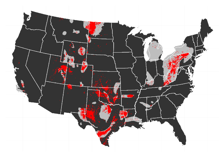
Here are some preliminary snippets. The data used in this study comes from Zillow.com In Fall 2013 I downloaded data for recently sold houses. I focused the download to cover all or most of the counties that are somewhat near the Marcellus shale in West Virginia, Ohio and Pennsylvania. This list goes back to 2011 and provides data for 151,156 sold properties.

load(file = "HOUSES.rdata")
library(xtable)
table(HOUSES$year)
####  2011  2012  2013
#### 40087 63248 47821

A simple tabulation suggests that most data is for 2012.

Some characteristics that are included in the data are the sale price in USD, the number of bedrooms, number of bathrooms, the built up land size in square feet, the year the property was built and for some properties also the lot size.

The properties have geo-coordinates, which are used to intersect the location of the property with census-tract shapefiles. This will allow the adding of further characteristics at the census-tract level to control for general local characteristics.

The geo-coordinates are further used to compute the exact distance of a property to the nearest actual or permitted well in the year that the property was sold. Distances are computed in meters by computing the Haversine distance on a globe with radius r = 6378137 meters.

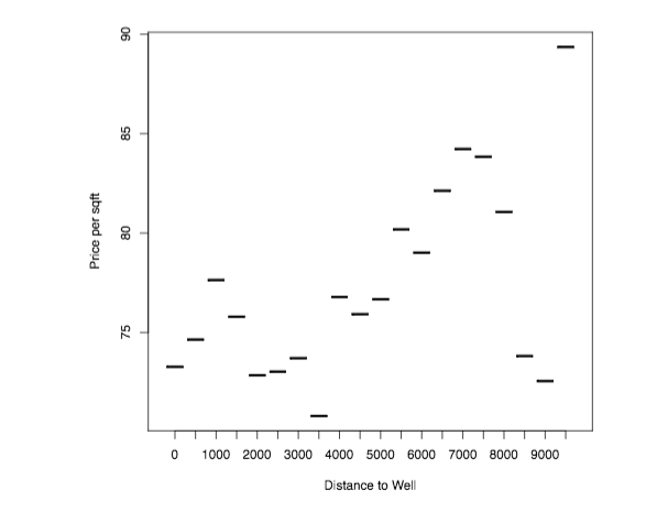
The following graph plots the average price per square foot as a function of distance to the nearest well in the year in which the property was sold. I group distances into 500 meter bins.

plot(HOUSES[, list(soldprice =sum(soldprice)/sum(sqft)), by=distancecat ], xlab="Distance to Well", ylab="Price per sqft")

A first inspection suggests a positive gradient in distance, that is – however, quite non-monotone.

Non-monotonic relationship between distance to the nearest oil or gas well and price per sqft.

Does this relationship hold up when running a hedonic pricing regression?

[math]log(y_{ict}) = \gamma \times welldistance_{i} + \beta \times X_i + a_c + \eta_t + e_{ict}[/math]

These are estimated using the lfe package, as I introduce quite demanding fixed effects (census-tract and county by year). The lfe package takes these fixed effects out iteratively before running the actual regression on the demeaned data.

The results for two chosen bandwidths are presented in the table below. There appears to be a positive gradient – being further away from a well correlates with higher prices per square foot.

Regression results comparing sold houses nearby unconventional gas wells on the Marcellus shale

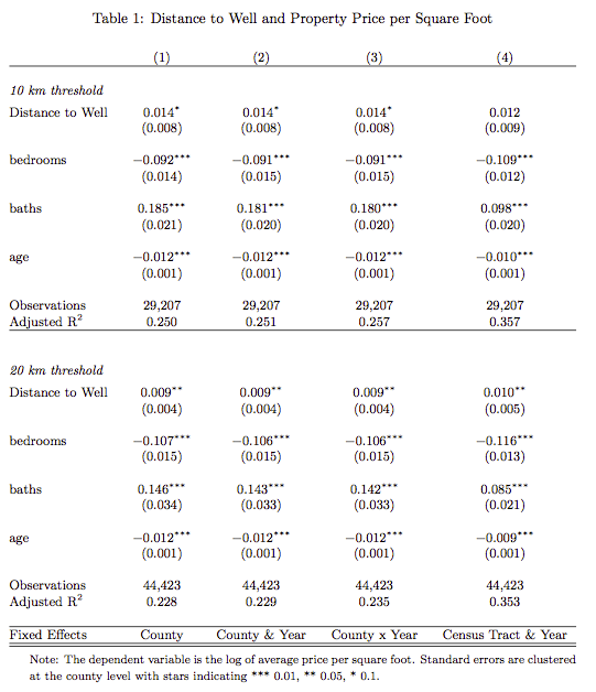
Clearly, the important question is whether one can separate out the property price appreciation that is likely to happen due to the local economic boom from the price differentials that may arise due to the presence of the local externalities and whether, one can separate out externalities due to environmental degradation as distinct from price differentials arising due to factors discussed in the beginning: no access to mortgage lending or insurances.

Unfortunately, I do not have the time to spend more time on this now, but I think a short paper is still feasible…


Mobility from Mobile Phones

I have worked on big data in my work with QuBit in London. In my research I increasingly find the tools I learnt there to be extremely useful. The keywords are smart data management for big data, such as hadoop and hive for querying just the right set of data to work with. I am currently working on Mobile Phone usage data provided by Orange Senegal as part of their data for development challenge. The scope for using big data for development is immense. Many African countries have seen extremely rapid urbanization, essentially moving from an agrarian economy straight into a service sector economy. Mobile technology is being developed in tech hubs across Africa, be it in Dar Es Salaam, Nairobi or in Dakar. Mobile money is a revolution in itself.

Development planning in Africa can not rely on tools used in developed countries: there are for example, no sophisticated traffic monitoring systems in place to help planners keep track of traffic flows, dispatch police units to congested spots. Mobile phone usage data may turn out to be an incredibly useful tool for development planners as it theoretically allows an analysis of human mobility along the mobile phone mast network. This allows planners to get a sense of population density and how population moves within an urban setting. This may help in development planning, but can turn out to be useful on many other dimensions. For example, epidemiological models of disease may make find in mobile phone data a useful input to model spread of diseases.

In any case, there is little economics literature that has worked with mobile phone use data so far. The two constraints are, first, getting the data in the first place and second, how to work with true “big data”. I have submitted a proposal for the Orange Data for Development Challenge Senegal and obtained the mobile phone Call Detail Records data. This is data collected by mobile phone companies for billing purposes and basically records, for every user, when and where (at which mobile phone tower) they have used their phone, either by receiving or making a call or by receiving or sending a text message. The result is three datasets made available to researchers. The datasets are based on Call Detail Records (CDR) of phone calls and text exchanges between more than 9 million of Orange’s customers in Senegal between January 1, 2013 to December 31, 2013. The datasets are: (1) antenna-to-antenna traffic for 1666 antennas on an hourly basis, (2) fine-grained mobility data on a rolling 2-week basis for a year with bandicoot behavioral indicators at individual level for about 300,000 randomly sampled users, (3) one year of coarse-grained mobility data at arrondissement level with bandicoot behavioral indicators at individual level for about 150,000 randomly sampled users.

I want to fine tune into the Dakar region. The capital is capturing most of mobile phone users and its most interesting to study mobility there. This constraints the focus on the fine-grained mobility data for rolling 2 week time windows. Just to get a sense of the type of data we are talking about. Suppose that every of the 300,000 users received was active in every hour of the time window, so that it is a truely balanced hourly panel, the resulting dataset would have 100.8 million rows. It is not possible to hold such amounts of data in the working memory on a conventional computer running Stata. R is a lot more capable to work with big data.

First, R provides the necessary architecture to run certain routines for efficient data processing directly using C code. This ensures that big R data objects are not moved around in the working memory, but that operations are done using the “physical storage” address of the data using C pointers. Most prominently the R package “dplyr” developed by Hadley Wickham is extremely useful as it allows running operations on these very huge data frames in just a few seconds.

I just wanted highlight here the approach I have taken so far in converting the unwieldy data objects into something useable. The idea is first, to zoom in to the Dakar region. This part is only a small share when it comes to comparing with the size of the country, but it absorbs most of the mobile phone users that are sampled. Out of 300,000 sampled users, on average 120,000 or 40% are located in the Dakar region.

senegal-dakar

Dakar Region only small in size relative to rest of the country

The accumulation of users in the Dakar region implies that there the mobile phone network is quite dense. In total there are 1666 antennas reported, but 489, or 29.3% of these antennas are clustered in the Dakar region.

dakar

Dakar Region and Mobile Phone Network Masts with overlayed .01 degree grid

The idea will be to construct measures of mobility at a spatial resolution. A user will only be registered in the antenna that he or she is locked in. Some antennas are extremely close to one another. In order to get a continous measure across space I compute a grid and associate grid cells with mobile phone masts. The above picture is of a 0.01 degree grid (roughly 1 km since we are not far from the equator). Leaving out the Bambilor arrondisement in Rufisque department (the big and sparse chunk on the right), almost every grid cell contains a mobile phone mast.

The first approach I have taken is to get a sense of population density: where are people usually located in the morning, evening and afternoon hours. The idea is that, especially, the location in the evening hours is the place in which individuals live (spend the night so to say). The location during the day may reflect the location where individuals are working. To highlight how this looks, consider the picture below. This plots out the average evening location of individuals in the central capital region. This information is displayed in two ways. First, the grid cell coloring is related to the number of people inside that grid cell, on average, for the evening hours in a two week time window. Second, the red dots indicate individual locations. If people were only logged in to one mobile phone mast every evening, then this would show up as a cluster of points around the mobile phone mast. In this case, the information at the grid level is useful. The fact that we see many individual red dots suggests that also in the evening, there is some mobility even if it is only within a grid cell.

Location of Population in Evening Hours

Average Location of Mobile Phone Users in Evening Hours

We can construct crude average morning, afternoon and evening locations. This then allows a construction of a measure of average mobility during the day time in a two week time window. The distances travelled can be visually plotted.

The figure below is a first attempt. This is obviously ongoing research…

travelling4

Mobility of Individuals in Dakar: Lines indicate straight line travel distances from the average morning, afternoon and evening location.

Regressions with Multiple Fixed Effects – Comparing Stata and R

In my paper on the impact of the recent fracking boom on local economic outcomes, I am estimating models with multiple fixed effects. These fixed effects are useful, because they take out, e.g. industry specific heterogeneity at the county level – or state specific time shocks.

The models can take the form:

[math]y_{cist} = \alpha_{ci} + b_{st} + \gamma_{it}+ X_{cist}'\beta + \epsilon_{cist}[/math]  

where [math]\alpha_{ci}[/math] is a set of county-industry, [math]b_{ci}[/math] a set of state-time and [math]\gamma_{it}[/math] is a set of industry-time fixed effects.

Such a specification takes out arbitrary state-specific time shocks and industry specific time shocks, which are particularly important in my research context as the recession hit tradable industries more than non-tradable sectors, as is suggested in Mian, A., & Sufi, A. (2011). What Explains High Unemployment ? The Aggregate Demand Channel.

How can we estimate such a specification?
Running such a regression in R with the lm or reg in stata will not make you happy, as you will need to invert a huge matrix. An alternative in Stata is to absorb one of the fixed-effects by using xtreg or areg. However, this still leaves you with a huge matrix to invert, as the time-fixed effects are huge; inverting this matrix will still take ages.

However, there is a way around this by applying the Frisch-Waugh Lovell theorem iteratively (remember your Econometrics course?); this basically means you iteratively take out each of the fixed effects in turn by demeaning the data by that fixed effect. The iterative procedure is described in detail in Gaure (2013), but also appears in Guimaraes and Portugal(2010).

Simen Gaure has developed an R-package called lfe, which performs the demeaning for you and also provides the possibility to run instrumental variables regressions; it theoretically supports any dimensionality of fixed effects. The key benefit of Simen Gaure’s implementation is the flexibility, the use of C in the background for some of the computing and its support for multicore processing, which speeds up the demeaning process dramatically, especially the larger your samples get..

In Stata there is a package called reg2hdfe and reg3hdfe which has been developed by Guimaraes and Portugal (2010). As the name indicates, these support only fixed effects up to two or three dimensions.

Lets see how – on the same dataset – the runtimes of reg2hdfe and lfe compare.

Comparing Performance of Stata and R

I am estimating the following specification

[math]y_{cist} = \alpha_{ci} + b_{sit} + \gamma_{it}+ X_{cist}'\beta + \epsilon_{cist}[/math]  

where [math]\alpha_{ci}[/math] is a set of county-industry, [math]b_{ci}[/math] a set of state-time fixed effects. There are about 3000 counties in the dataset and 22 industries. Furthermore, there are 50 states and the time period is also about 50 quarters. This means – in total – there are 3000 x 22 = 66,000 county-industry fixed effects to be estimated and 22 x 50 x 50 = 55,000 time fixed effects to be estimated. The sample I work with has sufficient degrees of freedom to allow the estimation of such a specification – I work with roughly 3.7 million observations.

I have about 10 covariates that are in [math]X_{cist}[/math], i.e. these are control variables that vary within county x industry over state x industry x time.

Performance in Stata

In order to time the length of a stata run, you need to run
set rmsg on, which turns on a timer for each command that is run.

The command I run in stata is

reg2hdfe logy x1-x10,  id1(sitq ) id2(id) cluster(STATE_FIPS )

You should go get a coffee, because this run is going to take quite a bit of time. In my case, it took t=1575.31, or just about 26 minutes.

Performance in R 
In order to make the runs of reg2hdfe and lfe, we need to set the tolerance level of the convergence criterion to be the same in both. The standard tolerance in Stata is set at $$1e^{-6}$$, while for lfe package it is set at $$1e^{-8}$$. In order to make the runs comparable you can set the options in the R package lfe options explicitly:

options(lfe.eps=1e-6)

The second change we need to make is to disallow lfe to use multiple cores, since reg2hdfe uses only a single thread. We can do this by setting:

options(lfe.threads=1)

Now lets run this in R using:

system.time(summary(felm(log(y) ~ x1 + x2 +x3 +x4 + x5 + x6 + x7 +x8 + x9 + x10 + G(id)+G(sitq),
data=EMP, cluster=c("STATE_FIPS"))))

The procedure converges in a lot quicker than Stata…

 user system elapsed 
208.450 23.817 236.831 

It took a mere 4 minutes. Now suppose I run this in four separate threads…

user system elapsed 
380.964 23.540 177.520


Running this on four threads saves about one minute in processing time; not bad, but not too much gained; the gains from multi-threading increase, the more fixed-effects are added and the larger the samples are.

Classi-Compare of Raster Satellite Images – Before and After

For my research on the effect of power outages on fertility , we study a period of extensive power rationing that lasted for almost a whole year and affected most of Latin America, but in particular, it affected Colombia. The key difficult was to determine which areas were exposed to the power-outage and the extent to which this was the case. This is not straightforward, since there does not exist household- or even municipality level consumption data.

But here is how R and Satellite Data can help. In particular, we study the night light series obtained from the Defense Meterological Sattelite Program, which has been discussed by Jeffrey before.

We simply look for abnormal variation in municipality level light-emitting intensity from 1992 to 1993.

Here is some code that generates some Raster-Maps using the package rasterVis , and uses jQuery to generate a fancy before and after comparison to highlight the year-on-year changes in light intensity of 1992 compared to 1993.

###load the raster images
tif<-"F101992.v4b_web.stable_lights.avg_vis.tif"
f151 = raster(tif)

tif<-"F101993.v4b_web.stable_lights.avg_vis.tif"
f152 = raster(tif)

##crop a smaller window to plot

e = extent(-78,-72,2,8)
#e = extent(-80,-78,-4.6,-2)
rn= crop(f151, e)
rn2= crop(f152, e)

### do a logarithmic transformation to highlight places that receive not much, but some light.

rn<-log(rn+1)
png("1992.png")
p <- levelplot(rn, layers=1, margin=FALSE,col.regions = gray(0:100/100))
p + layer(sp.polygons(COLPOB, lwd=.25, linetype=2, col='darkgray'))
dev.off()

rn2<-log(rn2+1)
png("1993.png")
p <- levelplot(rn2, layers=1, margin=FALSE,col.regions = gray(0:100/100))
p + layer(sp.polygons(COLPOB, lwd=.25, linetype=2, col='darkgray'))
dev.off()

Now with this together, you can create a fancy slider as I have seen on KFOR — comparing satellite pictures of towns before and after a tornado went through them.

The code is essentially just borrowed from that TV station and it loads the javascript from their server; it is essentially just a clever use of jQuery and is maybe something that could or is already implemented in an R reporting package? Do you know of such a function?

Anyways, all you need is a slider.html page that contains the code referring to the two picture sources; the code is simple:


<!DOCTYPE html>
<html>
  <head>
    <meta http-equiv="Content-Type" content="text/html; charset=UTF-8">
    <script src="https://ajax.googleapis.com/ajax/libs/jquery/1.8.3/jquery.min.js"></script>
    <script src="http://cache.ltvcms.com/localtv/tornado2/js/jquery.classycompare.js"></script>
    <link rel="stylesheet" type="text/css" href="http://cache.ltvcms.com/localtv/tornado2/css/jquery.classycompare.css">
    <style type="text/css">.sample1 {width:725px; height:725px;}.sample2 {width:725px; height:725px;}.sample3 {width:725px; height:725px;}</style>
  </head>
  <body>
    <div id="wrapper">
      <div class="container_6 clearfix">
        <section class="main-section grid_6">
          <div class="main-content">
            <section class="clearfix">
              <div>
                <div class="container" style="position:relative">
                  <div class="sample1"> <img src="1992municio.png"
                      alt="Before"
                      height="725px"
                      width="725px">
                    <img src="1993municio.png"
                      alt="After"
                      height="725px"
                      width="725px">
                  </div>
                </div>
                <script>
                                        $(window).load(function() {
                                            $('.sample1').ClassyCompare({
                                                defaultgap:50,
                                                leftgap:0,
                                                rightgap:10,
                                                caption: true,
                                                reveal: 0.5
                                            });
                                        });
                                    </script> </div>
            </section>
          </div>
        </section>
      </div>
    </div>

  </body>
</html>


This is how it looks — I know the stuff is not perfectly aligned, partly because when cropping the picture I made a mistake and could not be bothered with fixing it.

Have fun!


rgeos: TopologyException – found non-noded intersection between..

I have been having some issues generating spatial unions and intersections using the rgeos package. The package is extremely powerful, as it serves as an R interface to the powerful GEOS engine.

However, when working with shapefiles or polygons, quite often you will come across a whole range of errors, typically around topology exceptions. These occur in a whole range of applications — they typically throw errors of the type:

TopologyException: found non-noded intersection between LINESTRING (-59.0479 -1.85389, -59.048 -1.854) and LINESTRING (-59.0482 -1.854, -59.0477 -1.854) at -59.048000000000002 -1.8540000000000001

As becomes evident from this error, the error occurs in the xth decimal point, so it should really not be an error really? There are alternative issues that may arise if you try to create a Spatial Intersection of two Polygons that have different precisions.

What typically works in resolving these issues is a combination of two things.


  1. Round the polygon coordinates so that you end up having the same precision if you are creating spatial intersections of polygons coming from different sources. A function that implements this is for example:
 roundPolygons<-function(shptemp, digitss=3) {
for(i in 1:length(shptemp)) {
shptemp@polygons[[i]]@Polygons[[1]]@coords&<-round(shptemp@polygons[[i]]@Polygons[[1]]@coords,digits=digitss)
}
shptemp
}
  1. A second quick fix is to create a buffer area around the polygons you are trying to intersect, here rgeos has a predefined gBuffer function. You just need to specifiy the width of the buffer and then run the Spatial Union or Intersection with the buffered objects.

In most applications the combination of these two solved all my rgeos spatial join issues.

Computing Maritime Routes in R

Thanks to the attention my paper on the cost of Somali piracy has received, a lot of people have approached me to ask how I computed the maritime routes. It is not a very difficult task using R. The key ingredient is a map of the world, that can be rasterized into a grid; all the landmass needs to be assigned an infinite cost of crossing and last but not least — one needs to compute the actual routes.

What packages do I need?

library(gdistance)
library(maptools)
data(wrld_simpl)
library(data.table)

The package gdistance does most of the actual work of computing the routes. The wrld_simpl map provides what is needed to generate a raster.

Generating a Raster

#create a raster from shape files
shp <- wrld_simpl
r <- raster()
r <-rasterize(shp, r, progress='text')

After the raster is generated, we can proceed by making landmass impassable for vessels.

#make all sea = -999
r[is.na(r)] <- -999
#this turns all landmass to missing
r[r>-999] <- NA
#assign unit cost to all grid cells in water
r[r==-999] <- 1

There are a few more things to do, such as opening up the Suez Canal and some other maritime passages — one needs to find the right grid cells for this task. In the next step we can transform the raster into a transition layer matrix, that comes from the gdistance package. It is a data construct that essentially tells us how one can move from one cell to the other — you can allow diagonal moves by allowing the vessel to move into all 8 adjacent grid cells. There is also a geo-correction necessary, as the diagonals are longer distances than the straight-line moves.

tr <- transition(r, mean, directions = 8)
tr <- geoCorrection(tr, "c")

Well — and thats basically it — of course, there are a few bits and pieces that need additional work — like adding heterogenuous costs as one can imagine exist due to maritime currents and so on. Furthermore, there is a whole logic surrounding the handling of the output and the storing in a local database for further use and so on.

But not to bore you with that — how can I obtain the distance between A and B? This uses Dijkstra’s Algorithm and is called through the gdistance function “shortestPath”.

AtoB <- shortestPath(tr, as.numeric(start[1:2]), as.numeric(end[1:2]), output = "SpatialLines")

Using this output, you can then generate fancy graphs such as …


R function: generate a panel data.table or data.frame to fill with data

I have started to work with R and STATA together. I like running regressions in STATA, but I do graphs and setting up the dataset in R. R clearly has a strong comparative advantage here compared to STATA. I was writing a function that will give me a (balanced) panel-structure in R. It then simply works by joining in the additional data.tables or data.frames that you want to join into it.

It consists of two functions:

timeVector <- function(starttime,endtime,timestep="months") {

starttime<- as.POSIXct(strptime(starttime, '%Y-%m-%d'))
endtime<- as.POSIXct(strptime(endtime, '%Y-%m-%d'))
if(timestep=="quarters") {
timestep="months"
ret<-seq(from=as.POSIXct(starttime), to=as.POSIXct(endtime), by=timestep)
quarter <- gsub("(^[123]{1}$)", 1, month(ret))
quarter <- gsub("(^[456]{1}$)", 2, quarter)
quarter <- gsub("(^[789]{1}$)", 3, quarter)
quarter <- as.numeric(gsub("(^[102]{2}$)", 4, quarter))

ret<-paste(year(ret),quarter,sep="-")
ret<-unique(ret)
} else {

ret<-seq(from=as.POSIXct(starttime), to=as.POSIXct(endtime), by=timestep)
}
ret

}

This first function generates the time-vector, you need to tell it what time-steps you want it to have.

panelStructure <- function(group,timevec) {
tt<-rep(timevec,length(group))
tt2 <- as.character(sort(rep(group,length(timevec))))
mat <- cbind("group"=data.frame(tt2),"timevec"=data.frame(tt))
names(mat)<-c("group","timevec")
mat
}

This second function then generates the panel-structure. You need to give it a group vector, such as for example a vector of district names and you need  to pass it the time vector that the other function created.

Hope this is helpful to some of you.


Removing Multibyte Characters from Strings

I was a bit annoyed by the error when loading a dataset that contains multi-byte characters. R basically just chokes on them. I have not really understood the intricacies of this, but it was basically just an annoyance and since I did not really use these characters in the strings containing them, I just wanted to remove them.

The easiest solution was to use Vim with the following search and replace:

s/[\x80-\xFF]//g

Microfinance Map of India – another go…

I gave it another go, trying to get a map that looks a bit nicer. This time, I tried to compute something like a density or intensity in a certain area. On the previous map, this was not visible very well. I used ggplot2 and a bit of R code, together with RGoogleMaps to produce the following picture:

This map displays the intensity of microfinance institution headquarter distribution across India. The data comes from the MIX Market.


The fact that many MFIs are clustered around in the south is highlighted quite strongly. What this graph does not take into account however, is their variable size. This is problematic and I agree that this needs further refinement, i.e. that the intensity takes into account how big an MFI is. However, I would conjecture that this merely makes the contrasts in such a map just stronger.


Microfinance in India: Getting a sense of the geographic distribution

I am working on a review paper on microfinance in India and use data from the MIX market. Today, I was amazed by how quick I conjured a map of India with the headquarters of the microfinance institutions that report data to the MIX market depicted on that map. Ideally, I would have more geolocation data – but this is hard to come by. But what we can clearly see is the clustering of institutions in big cities and in the south, which was hit hardest by the recent crisis.

Microfinance Institutions across India


I dont think anybody has produced such a map before. In fact, I can do this for all institutions reporting data around the world, which may be interesting to see. Also, I already tried to make the size of the dot proportional to e.g. measures of real yield or color-coding the nearest neighborhood (say the neigbhouring districts) by the average loan sizes reported. Lots of things to do. Maybe thats something for the guys at MIX Market or for David Roodman who, I think has finished his open book.

The key difficulty was actually not in plotting the map (though it took some time), but in obtaining geo-data on where the headquarters of the microfinance institutions are located. I managed to obtain this data – though its not perfect – by making calls to the Google MAP API via a PHP script., basically using the following two functions:

Continue reading Microfinance in India: Getting a sense of the geographic distribution

R Function Binding Vectors and Matrices of Variable Length, bug fixed

Now this is something very geeky, but useful. I had to bind two matrices or vectors together to become a bigger matrix. However, they need not have the same number of rows or even the same row names.

The standard cbind() functions require the vectors or matrices to be compatible. The matching is “stupid”, in the sense that it ignores any order or assumes that the elements which are to be joined into a matrix have the same row names. This, of course, need not be the case. A classical merge command would fail here, as we dont really know what to merge by and what to merge on.

Ok… I am not being clear here. Suppose you want to merge two vectors

A 2
B 4
C 3

and

G 2
B 1
C 3
E 1

now the resulting matrix should be

A  2  NA
B  4  1
C  3  3
E NA  1
G NA  2

Now the following Rfunction allows you to do this. It is important however, that you assign rownames to the objects to be merged (the A,B,C,E,G in the example), as it does matching on these.

cbindM <-
function(A, v, repl=NA) {

  dif <- setdiff(union(rownames(A),rownames(v)),intersect(rownames(A),rownames(v)))
#if names is the same, then a simple cbind will do
    if(length(dif)==0) {

      A<- cbind(A,v[match(rownames(A),rownames(v))])

        rownames(A) <- rownames(v)

    }    else if(length(dif)>0) {#sets are not equal, so either matrix is longer / shorter

#this tells us which elements in dif are part of A (and of v) respectively      
      for(i in dif)     {

        if(is.element(i,rownames(A))) {
#element is in A but not in v, so add it to v and then a        

          temp<-matrix(data =repl, nrow = 1, ncol = ncol(v), byrow = FALSE, dimnames =list(i))
            v <- rbind(v,temp)

        } else {
# element is in v but not in A, so add it to A

          temp<-matrix(data = repl, nrow = 1, ncol = ncol(A), byrow = FALSE, dimnames =list(i))
            A<-rbind(A,temp)
        }
      }


      A<-cbind(A,v[match(rownames(A),rownames(v))])

    }

  A
}

Note: 09.11.2011: I fixed a bug and added a bit more functionality. You can now tell it, with what you want the missing data to be replaced. Its standard to replace it with NA but you could change it to anything you want.